Multiline Inputbox
axMultilineInputbox
Description
axMultilineInputBox allows a user input of more than one line of text. The text display depends on the size of this extension. The text will go to the next line when it overflows the width while vertical scrollbar becomes visible when the text overflows the height.
Usability
|
Context |
Supported |
|---|---|
|
Input screen fields |
Yes |
|
Output screen fields |
Yes |
|
Input subfile fields |
Yes |
|
Output subfile fields |
Yes |
|
New screen elements |
Yes |
Properties
|
Name |
Description and Comments |
JavaScript |
Shipped default |
|---|---|---|---|
|
enabled |
Indicates whether this element is enabled.
|
Yes. Must return a Boolean. |
True |
|
helpertext |
The helepertext provides supplemental information to users.
|
No |
None |
|
imeMode |
When a screen element is an input field this property indicates whether the Input Method Editor (IME) should be active or inactive for this field. Possible values are ‘Default’, ‘Active’ and ‘Inactive’. The ‘Default’ setting means that AXES will determine automatically whether to turn IME on or off based on the language used. * IME mode is only supported in Internet Explorer. This property will not work in other browsers. |
Yes. Must return “default”, “active”, or “inactive” |
Default |
|
maxInputLength |
When a screen element is an input field this property specifies the maximum number of characters the field will accept. Value of "0" is a special value and its meaning depends on the type of the element: For existing 5250 field, value of 0 means that the original 5250 field’s length will be used. For new elements, value of 0 means that the field’s length is unlimited. This property is designed intended for use with new input elements added to a 5250 screen. It is not intended for use with existing 5250 screen elements. |
Yes. Must return a number. |
0 |
|
onBlur |
Optional. JavaScript code to be executed when the element loses the focus. |
Yes |
None |
|
onChange |
Optional. JavaScript code to be executed when the value changes. |
Yes |
None |
|
onFocus |
Optional. JavaScript code to be executed when the element receives the focus. |
Yes |
None |
|
placeholderText |
The text to be displayed as a short hint for this extension. This also acts as a label in Material Design theme. |
No |
None |
|
style |
CSS properties to be applied to the eXtension. |
Yes. Must return a valid style object |
None |
|
value |
Indicates the initial value of the input element. |
No |
None |
Notes, Comments and Warnings
This eXtension works only in the advanced terminal emulator (TS2) and is not intended to be run in the basic terminal emulator (TS1).
The Enter key is available in this eXtension to move the cursor to the next line.
When this extension’s Basic->type property is set to output, this extension becomes read-only.
The value of placeHolderText property displayed in this extension has a fixed style color of #999. Even if this extension’s style->color property is set to another color, the display of the placeholder text will not be affected.
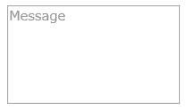
In Application, appStylesTheme property = JQueryUI
When JQueryUI is selected in Application->Styling->appStylesTheme property, the display will change according to the theme that was set in the Application’s jqueryTheme property. Basically, the default border and the font styles will be based on the JQuery theme.
When placeholderText property is set:
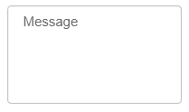
In Application, appStylesTheme property = Material Design
When Material Design is selected in Application->Styling->appStylesTheme property, the display will change according to the theme that was set in the Application’s mdTheme property.
When placeholderText property is set:
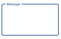
When this eXtension is focused:
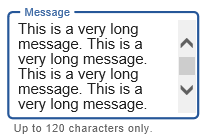
When helpertext property is set and this eXtension contains long text:
See Also
Application Style Collection for Application themes