Chips
axChips
Description
allows chips to be inserted into the 5250 screens. Chips are compact elements that allow users to enter information, select a choice, filter content, or trigger an action.
Usability
|
Context |
Supported |
|---|---|
|
Input screen fields |
No |
|
Output screen fields |
Yes |
|
Input subfile fields |
No |
|
Output subfile fields |
No |
|
New screen elements |
Yes |
Properties
|
Name |
Description and Comments |
JavaScript |
Shipped default |
|---|---|---|---|
|
items |
The value(s), caption(s), icon(s) of the item(s) to appear as set of chips | Yes. Must return an Array of Items | None |
|
onItemClick |
Indicates whether this element is enabled. TS2 only. |
Yes | None |
|
onScreenReady |
Javascript code to be executed after the screen has finished rendering. | Yes | None |
|
type |
Specifies the type of chips | Yes. Must return a string. | None |
Notes, Comments and Warnings
This extension is available only in material design theme.
Examples
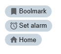
(1). An example of choice chips type with 3 set of chips
Modify the following Extension Property:
- type: Choice chips
- items property: add 3 entries for value,text,icon sub property
- bookmark, Bookmark, bookmark
- alarm, Set Alarm, alarm
- home, Home, home
The Chips extension will be displayed as follows:
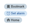
Add the following javascript to onItemClick:
console.log("value:"+ ENV.SelectedValue);
Open Browser developers tools to see the behavior of a choice chips highlights the selected chips.
View the console logs and see the results when one of chips is clicked.
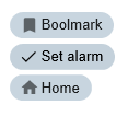
(2). An example of filter chips type with 3 set of chips same as example(1).
Modify the Extension type property to filter chips.
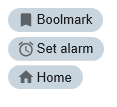
(3). An example of action chips type with 3 set of chips same as example(1).
Modify the Extension type property to action chips.
Note: The behavior of an action chips type is like a button.
Icon property
The icons that you can use is based on the localized version (shipped with axes) of google material design icon (web fonts). See https://material.io/tools/icons/?style=baseline for the list of icons.
See Also
Application Style Collection for Application themes