Default Visualization
axDefaultVisualization
Description
All 5250 and new screen elements have a default visualization.
It is used to visualize the element - unless you specifically indicate not to do this, typically because you want to:
Hide the element - by not visualizing it at all
Use an alternate visualization - like a radio button.
Usability
|
Context |
Supported |
|---|---|
|
Input screen fields |
Yes |
|
Output screen fields |
Yes |
|
Input subfile fields |
Yes |
|
Output subfile fields |
Yes |
|
New screen elements |
Yes |
Properties
|
Name |
Description and Comments |
JavaScript |
Shipped default |
|---|---|---|---|
|
AIDKeyOnDoubleClick |
Defines the AID key to post when the field is double clicked. (Applied to Output fields only) |
Yes. Must return a string. |
Enter |
|
value |
A value override that the element should be set to initially. |
Yes. Must return a string. |
None |
|
style |
Additional style properties that should be applied to the default visualization. |
Yes. Must return a valid style object. |
None |
|
removeCUADots |
When a screen element is an output field you can use this option to remove CUA style double spaced trailing dots from it. |
Yes. Must return a boolean. |
False |
|
maxInputLength |
p is a special value and its meaning depends on the type of the element:
For existing 5250 field, value of 0 means that the original 5250 field’s length will be used. For new elements, value of 0 means that the field’s length is unlimited. This property is designed intended for use with new input elements added to a 5250 screen. It is not intended for use with existing 5250 screen elements. |
Yes. Must return a number. |
0 |
|
imeMode |
When a screen element is an input field this property indicates whether the Input Method Editor (IME) should be active or inactive for this field. Possible values are ‘Default’, ‘Active’ and ‘Inactive’. The ‘Default’ setting means that AXES will determine automatically whether to turn IME on or off based on the language used. IME mode is only supported in Internet Explore. This property will not work in other browsers. |
Yes. Must return “default”, “active”, or “inactive” |
Default |
|
selectContentOnFocus |
Applies only to an input element. This property indicates whether the whole content of the input element should be selected when focus moves to the element. |
Yes. Must return a boolean. |
True |
|
enabled |
Indicates whether this element is enabled. TS2 only. |
Yes. Must return a Boolean. |
True |
Notes, Comments and Warnings
Use of the value property should be considered carefully and tested.
In Application, appStylesTheme property = JQueryUI
When JQueryUI is selected from Application->Styling->appStylesTheme, the display will change according to the theme that was set in the Application’s jqueryTheme property. Basically, the default border and the font styles will be based on the JQuery theme.
In Application, appStylesTheme property = Material Design
When Material Design is selected from Application->Styling->appStylesTheme, the display will change according to the theme that was set in the Application’s mdTheme property.
For browser compatibility reasons, setting the font-size in the style property will not work in TS2. Use the style property of the field’s basic properties for this purpose instead.
Examples
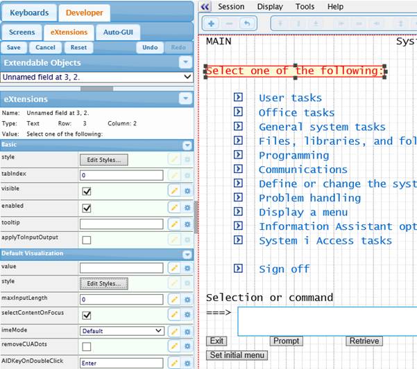
Here the default visualization of the instruction line on the System i Main menu has been altered to use color red in the style property:
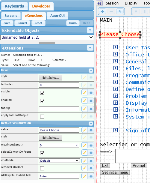
Now the instruction has been altered by setting its value property to Please Choose:
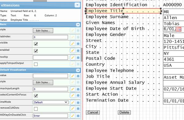
On this 5250 screen the Given Name field label is selected.
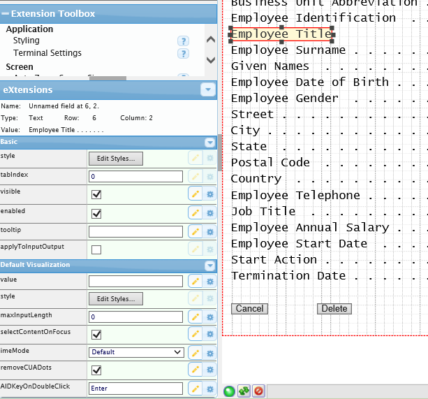
The removeCUADots property is changed to true, so the output field is now displayed like this:
See Also
Application Style Collection for Application themes