Extension Tutorial 4 - AutoGUI+
The AutoGUI+ feature is a powerful tool to setup application wide rules for modernisation. It allows the creation and maintenance of rules applied by our AutoGUI+ engine to enable inter-screens customisations.
Introduction
This tutorial provides examples on how to use Autogui+.
The Pre-defined Autogui+ Rules
When a new aXes project is created, a set of pre-defined rules are applied in the application by default, defined in the Autogui+ window.
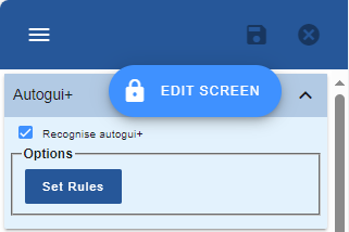
To access the Autogui+ in TS-2 Developer Mode, click Auto-GUI tab then click Set Rules button under Autogui+ menu.
The following image shows the Autogui+ predefined rules:
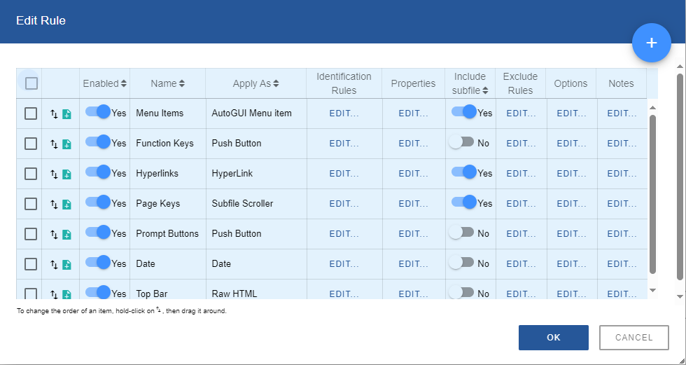
The above rules can be modified according to your preference.
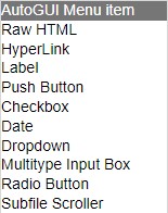
The currently available eXtensions that can be applied to elements are as follows:
Menu Items
The following example shows how to change the image and font style of menu items.
Original display:
Updated display:
To do:
1. Download any icon of your choice, name it as menuarrow.png and save it to /ts/screens/<private folder>.
The above icon used is downloaded from http://www.iconsdb.com/icon-sets/web-2-blue-icons/arrow-55-icon.html#custom_size with 12px as its size.

2. In Autogui+ window, locate the rule named “Menu Items”.
3. Click Edit button in the Properties column to display the eXtension’s properties window.
4. In the Properties menu, click Edit Styles button of style property and set the following attribute: font-style: italic
5. Close the Edit Styles dialog.
6. In the eXtensions menu, set the following property:
imageURL: /ts/screens/<private folder> /menuarrow.png
7. Click OK button to store the changes and close the Properties window.
8. Click OK button to store the changes and close the Autogui+ window.
9. Click Save button.
10. Log in to your project to confirm the changes has been applied to your project.
Note:
Make sure to change the permission of the downloaded files to:
*PUBLIC *R
Function Keys
(F|PF|FP|CF)\d{1,2} *=
To apply a rule to the target function key, it is necessary to exclude it in the pre-defined Function Keys Rule.
Original display:
Updated display:
To do:
1. Download any icon of your choice, name it as cancel.png and delete.png, respectively and save it to /ts/screens/<private folder>.
The above icons used are downloaded from Guacamole green arrow 81 icon - Free guacamole green arrow icons (iconsdb.com), https://www.iconsdb.com/custom-color/delete-icon.html#custom_size with 12px as its size.
2. In Autogui+ window, click  button to add a new rule for Cancel function key.
3. Set the following rule:
Name: FKey Cancel
Apply As: Push Button
4. Click Edit button of Identification Rules column to display Edit Rule dialog.
5. In Edit Rule dialog, click button to add a new rule.
6. Set the following rule:
Position: Target
Contains: ^F12 *=
Field Type: Output
Start col: 1
End col: 80
7. Click OK button to store the changes and close the dialog.
8. Click Edit button in the Properties column to display the eXtension’s properties window.
9. In the eXtensions menu, click Edit Styles button of style property to open the Edit Styles dialog.
10. Set the following attributes:
background-image: url("/ts/screens/<private folder>/cancel.png")
background-position: 2px center
background-repeat: no-repeat
background-size: contain
text-align: right
width: 50px
11. Click OK to close the dialog.
12. Click OK button to store the changes and close the Properties window.
13. Click Edit button of Options column and check “Recognise function keys”.
14. Click OK button to store the changes and close the Options window.
15. In Autogui+ window, click  icon in the “FKey Cancel“ row to duplicate its contents.
16. In the newly copied rule, rename it to “FKey Delete”.
17. Click Edit button of Identification Rules column to display Edit Rule dialog.
18. In Edit Rule dialog, change the value of Contains to “^F22 *=”
19. Click OK button to store the changes and close the dialog.
20. Click Edit button in the Properties column to display the eXtension’s properties window.
21. In the eXtensions menu, click Edit Styles button of style property to open the Edit Styles dialog.
22. Edit the following attribute:
background-image: url("/ts/screens/<private folder>/delete.png")
23. Click OK to close the dialog.
24. Click OK button to store the changes and close the Properties window.
25. In Autogui+ window, locate the rule named “Function Keys”.

26. Click Edit button of Exclude Rules column to open Edit Exclusion Rules dialog.
27. In Edit Edit Exclusion Rules dialog, click button to add a new rule.
28. Set the following rule:
Action: Exclude element
Element value contains: ^(F12=|F22=)
Field Type: Output
29. Click OK button to store the changes and close the dialog.
30. Click OK button to store the changes and close the Autogui+ window.
31. Click Save button.
32. Log in to your project and go to screens with function key F12 and F22.
Note:
Make sure to change the permission of the downloaded files to:
*PUBLIC *R
Hyperlinks
The following example shows how to update the style of a hyperlink. The value of the link used below is “http://lansa.com”
Normal display:

When mouse is hovered on it:

To do:
1. In Autogui+ window, locate the rule named “Hyperlinks”.

2. Click Edit button in the Properties column to display the eXtension’s properties window.
3. In the eXtensions menu, click Edit Styles button of style property and set the following attributes:
border-bottom: 1px solid #d8d8d8
color: #548dd4
text-decoration: none
4. Click OK to close the Edit Styles dialog.
5. Click Edit Styles button of mouseOverStyle and set the following attributes:
border-bottom: 1px solid #548dd4
font-weight: bold
text-decoration: none
text-shadow: 0 0 2px #548dd4
6. Click OK to close the Edit Styles dialog.
7. Set “red” to mouseOverColor property.
8. Click OK button to store the changes and close the Properties window.
9. Click OK button to store the changes and close the Autogui+ window.
10. Click Save button.
11. Log in to your project and go to screens with data as hyperlink.
Page Keys
The following example shows how to change the image and style of Subfile Scroller used in page keys. The Page Key is an Output field and is identified by the following regular expression in the Identification Rules:
(^\s*(\+|More...|続く...|Más...|A suivre...|Weitere ...|尚有...|尚有...|계속 ...|Segue...)\s*$)|(^\s*(Bottom|終わり|Final|Fin|Ende|底端|底部|맨 아래|Fine)\s*$)
Original display:
Updated display:
To do:
1. Download any icon of your choice, name it as pageup.png and pagedown.png and save it to /ts/screens/<private folder>.
The above icons used are downloaded from http://www.iconsdb.com/icon-sets/web-2-blue-icons/arrow-203-icon.html#custom_size, http://www.iconsdb.com/icon-sets/web-2-blue-icons/arrow-141-icon.html with 9px as its size.
2. In Autogui+ window, locate the rule named “Page Keys”.

3. Click Edit button in the Identification Rules column to display Edit Rules dialog.
4. Change the value of Start Row to “19” then click OK to store the change.
5. Click Edit button in the Properties column to display the eXtension’s properties window.
6. In the Properties menu, click Edit Styles button of style property and set the following attribute:
top: 330px
width: 40px
7. Click OK to close the Edit Styles dialog.
8. In the eXtensions menu, set the following properties:
pgDnImageName: pagedown.png
pgDnImagePath: /ts/screens/<private folder> /
pgUpImageName: pageup.png
pgUpImagePath: /ts/screens/<private folder> /
9. Click OK button to store the changes and close the Properties window.
10. Click Ok button to store the changes and close the Autogui+ window.
11. Click Save button.
12. Log in to your project and go to screens with subfile to confirm the changes has been applied to your project.
Note:
Make sure to change the permission of the downloaded files to:
*PUBLIC *R
Prompt Buttons
The following example shows how to replace the “+” character with an icon for prompt buttons.
Original display:
Updated display:
To do:
1. Download any icon of your choice, name it as lookup.png and save it to /ts/screens/<private folder>.
The above icon used is downloaded from http://www.iconsdb.com/green-icons/opera-glasses-icon.html with 10px as its size.
2. In Autogui+ window, locate the rule named “Prompt Buttons”.

3. Click Edit button in the Properties column to display the eXtension’s properties window.
4. In the eXtensions menu, click Edit Styles button of style property and set the following attribute:
background-image: url("/ts/screens/<private folder>/lookup.png")
background-position-x: 2px
background-repeat: no-repeat
font-size: 0px
height: 14px
width: 16px
5. Close the Edit Styles dialog.
6. Click OK button to store the changes and close the Properties window.
7. Click Ok button to store the changes and close the Autogui+ window.
8. Click Save button.
9. Log in to your project to confirm the changes has been applied to your project.
Note:
Make sure to change the permission of the downloaded files to:
*PUBLIC *R
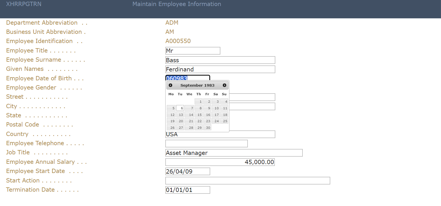
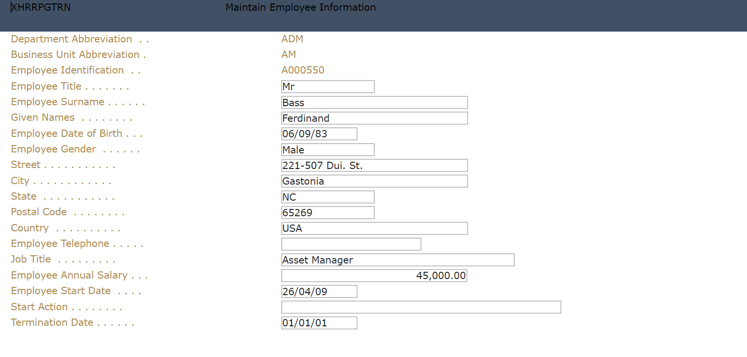
Date
The following example shows how to apply the Date extension to the input box with Date format. The shipped default format for Date is “dd/mm/yy” or “d/mm/yy”.
Original display:
Updated display:
To do:
1. In Autogui+ window, locate the rule named “Date”.

2. Click Edit button in the Properties column to display the eXtension’s properties window.
3. In the eXtensions menu, set the following properties:
hideCalendarImage: true
dateFormatDisplay: dd/mm/yy
4. Click OK button to store the changes and close the Properties window.
5. Click OK button to store the changes and close the Autogui+ window.
6. Click Save button.
7. Log in to your project and go to screens with Date input to confirm the changes has been applied to your project.
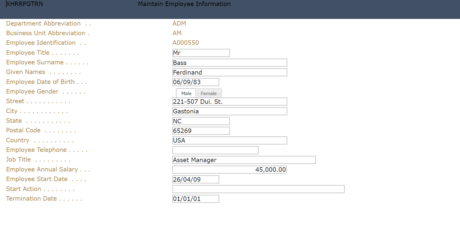
Radio Button
The following example shows how to apply the Radio Button extension to the input box with “Gender” as its label.
Original display:
Updated display:
To do:
1. In Autogui+ window, click button to add a new rule.
2. Set the following rule:
Name: Gender
Apply As: Radio Button
3. Click Edit button in the Identification Rules column to open the dialog.
4. Add two rules by clicking button twice.
5. Set the following rules:
[Rule 1]
Position: Target
Field Type: Input
[Rule 2]
Position: Left
Field Type: Output
Contains: Gender
6. Click OK button to store the changes and close the dialog.
7. Click Edit button in the Properties column to display the eXtension’s properties window.
8. In the Properties menu, set the style->width attribute to 150px.
9. In the eXtensions menu, set the following properties:
dataSourceType: Fixed Values
orientation: Horizontal
10. Click Edit Items button of fixedValues property and set the following:
[value] [text]
Male Male
Female Female
11. Click OK to close the dialog.
12. Click Edit Styles button of captionStyle property to open the Edit Styles dialog.
13. Set the font-size attribute to 10px.
14. Click OK to close the dialog.
15. Click Edit Styles of radioButtonStyle property to open the Edit Styles dialog.
16. Set the following attributes:
padding-bottom: 1px
padding-left: 8px
padding-right: 8px
padding-top: 1px
17. Click OK button to close the dialog.
18. Click OK button to store the changes and close the Properties window.
19. Click OK button to store the changes and close the Autogui+ window.
20. Click Save button.
21. Log in to your project and go to screens with Gender label and confirm the changes has been applied to your project.
Dropdown – using Static Table
The following example shows how to apply the Dropdown extension to the input box with label that starts with “Country”, and using static table as the dataSourceType.
Original display:
Updated display:
To do:
1. In Autogui+ window, click button to add a new rule.
2. Set the following rule:
Name: Country
Apply As: Dropdown
3. Click Edit button in the Identification Rules column to open the dialog.
4. Add two rules by clicking button twice.
5. Set the following rules:
[Rule 1]
Position: Target
Field Type: Input
[Rule 2]
Position: Left
Field Type: Output
Contains: ^Country
6. Click OK button to store the changes and close the dialog.
7. Click Edit button in the Properties column to display the eXtension’s properties window.
8. In the Properties menu, set the style->height property to 15px.
9. In the eXtensions menu, set the following properties:
dataSourceType: Static Table
tablename: ISOCountry
10. Click Edit Styles button of dropdownStyle property to open the Edit Styles dialog.
11. Set the following attributes:
font-size: 10px
padding- bottom: 0px
padding-top: 0px
12. Click OK button to close the dialog.
13. Click OK button to store the changes and close the Properties window.
14. Click OK button to store the changes and close the Autogui+ window.
15. Click Save button.
16. Log in to your project and go to screens with Country label and confirm the changes has been applied to your project.
Dropdown – using Dynamic Table
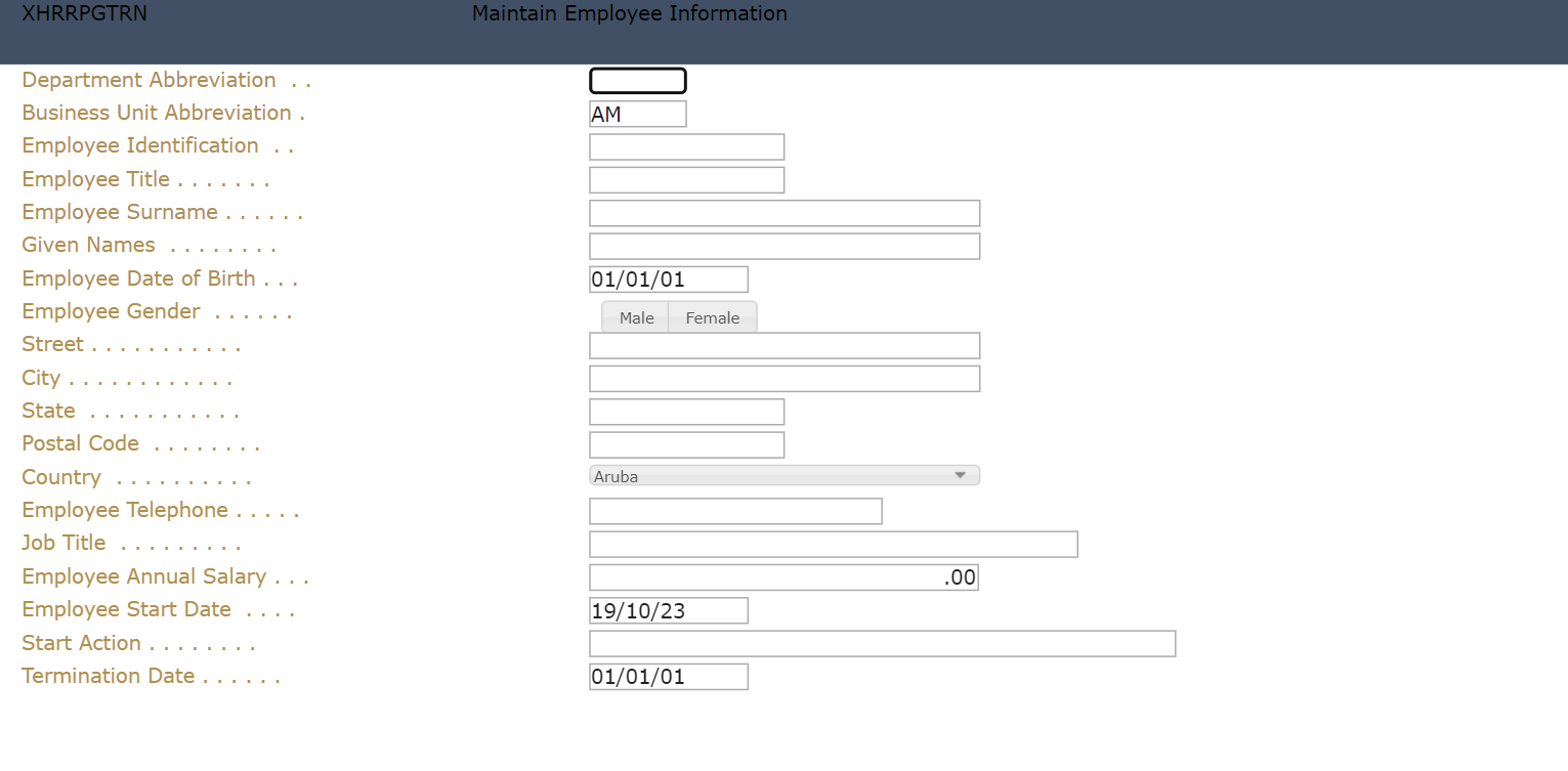
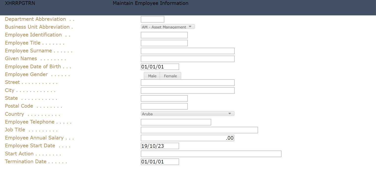
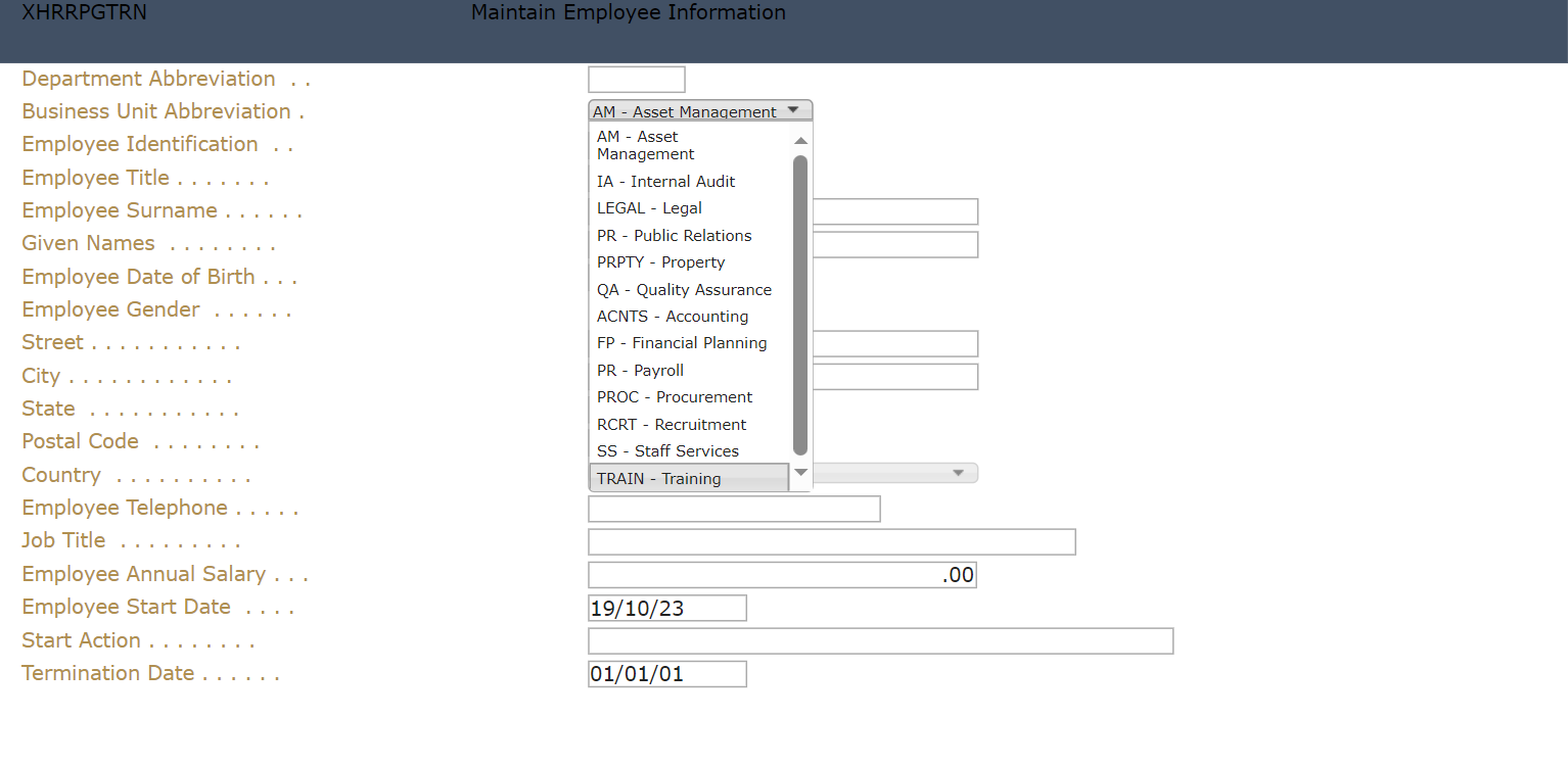
The following example shows how to apply the Dropdown extension to the input box with label that starts with “Business Unit Abbreviation”, and using Dynamic Table as the dataSourceType.
The Business Unit data is based on Department. Only from “ADM”, “FIN”, and “HR” departments will be loaded.
Original display:
Updated display:
To do:
1. In the project’s Edit Project Files, click Edit Dynamic Tables.
2. Add the following:
-- ==========================================================================
-- List of business units that belong to some departments specified by :SQLVariableDepartment
-- ==========================================================================
DefineObjectInstance {
className = "DynamicTable",
name = "SomeDepartmentBusinessUnits",
source = "sql",
selectSQLcommand = "XHRBUABRV,XHRBUSUNT from AXESDEMO.XHRBU where XHRDEPCDE in ( :SQLVariableDepartment )",
resultColumnNames = { "value", "text" },
};
Note: For axesJSM, use SQLVariable_InValues_Departments. Variables inside the IN should have SQLVariable_InValues_ as prefix.
3. Click Save and re-open the project.
4. In Autogui+ window, click button to add a new rule.
5. Set the following rule:
Name: Business Unit
Apply As: Dropdown
6. Click Edit button in the Identification Rules column to open the dialog.
7. Add two rules by clicking button twice.
8. Set the following rules:
[Rule 1]
Position: Target
Field Type: Input
[Rule 2]
Position: Left
Field Type: Output
Contains: ^Business Unit Abbreviation.+$
9. Click OK button to store the changes and close the dialog.
10. Click Edit button in the Properties column to display the eXtension’s properties window.
11. In the Properties menu, set the following attributes of style property:
height: 15px
width: 150px
12. In the eXtensions menu, set the following properties:
dataSourceType: Dynamic Table
sqlQueryName: SomeDepartmentBusinessUnits
13. Click Edit Script of sqlVariables property and type the following:
ENV.SQL.SQLVariableDepartment = "'ADM', 'FIN', 'HR'";
14. Click OK to close the dialog.
15. Click Edit Script button of onFillDropDown property and type the following:
ROW.value + ' - ' + ROW.text;
16. Click OK to close the dialog.
17. Click Edit Styles button of dropdownStyle property to open the Edit Styles dialog.
18. Set the following attributes:
font-size: 10px
padding- bottom: 0px
padding-top: 0px
19. Click OK button to close the dialog.
20. Click OK button to store the changes and close the Properties window.
21. Click OK button to store the changes and close the Autogui+ window.
22. Click Save button.
23. Log in to your project and go to screens with Business Unit label and input box next to it, and confirm the changes have been applied to your project.
Label
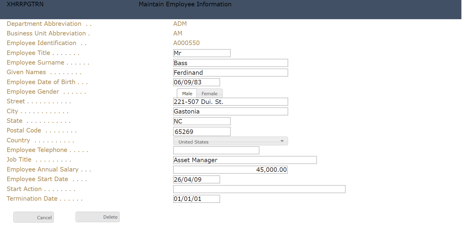
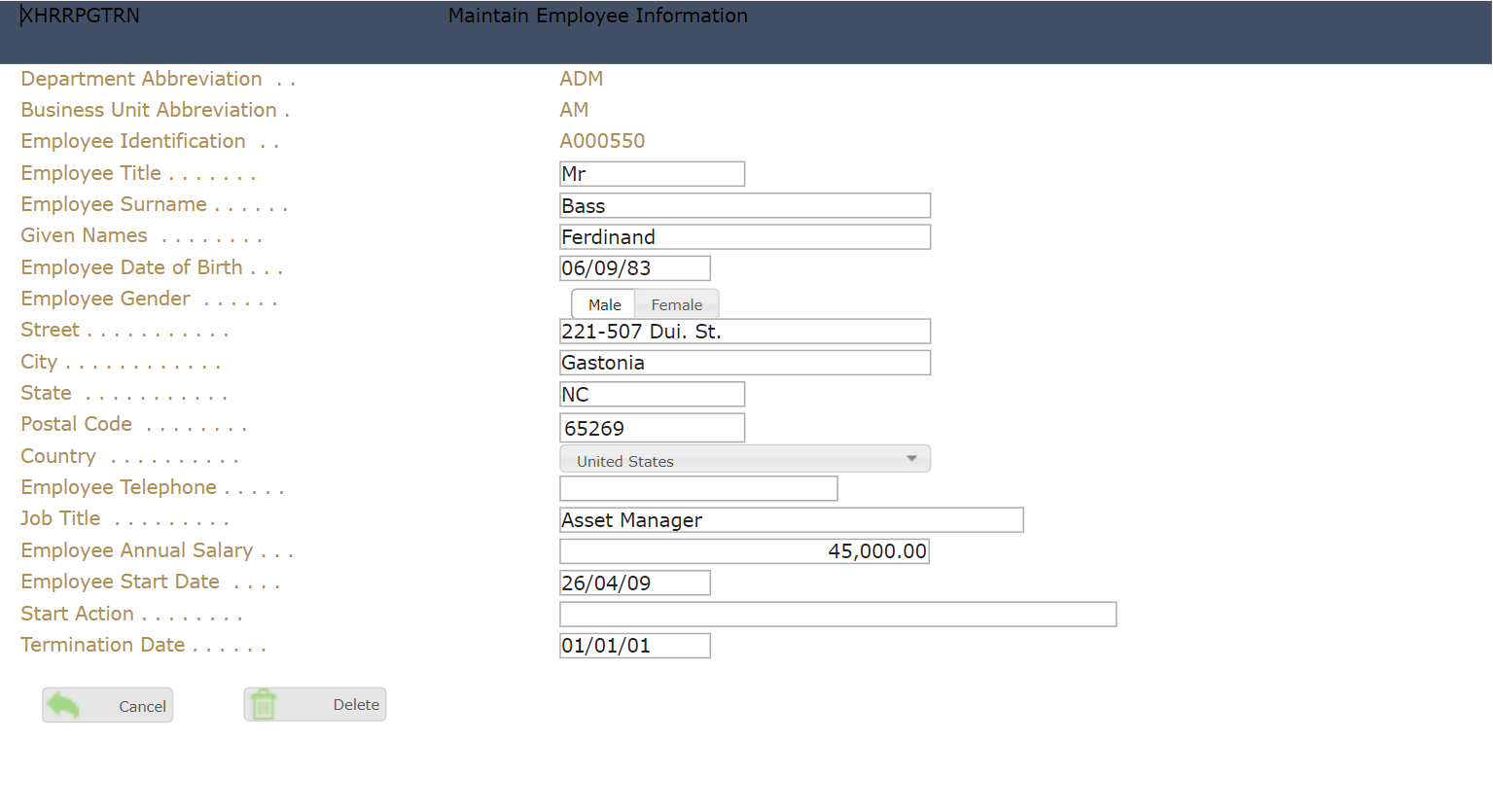
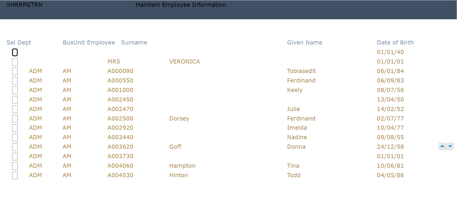
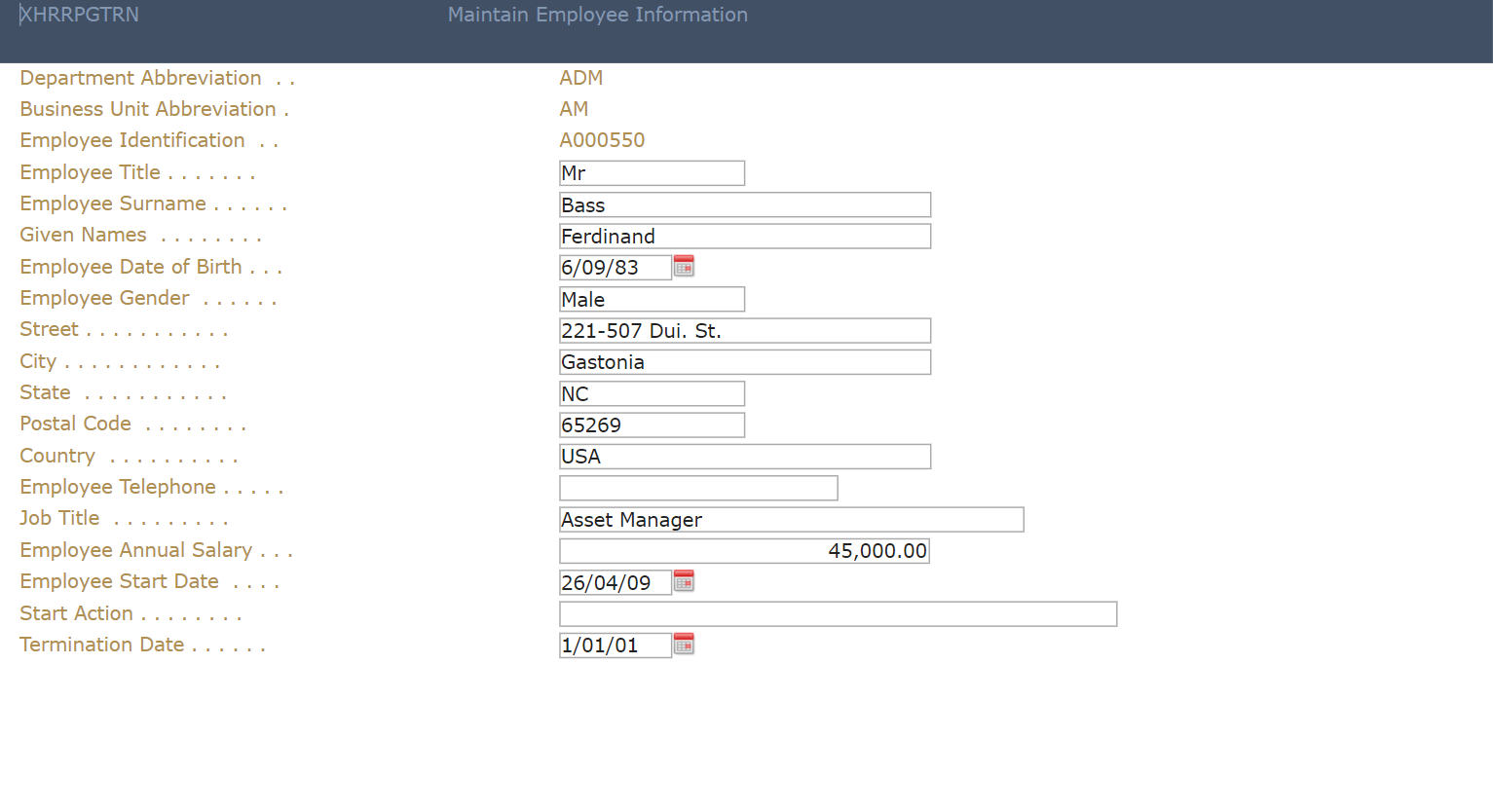
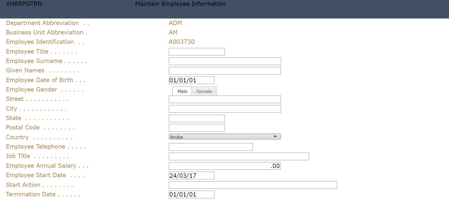
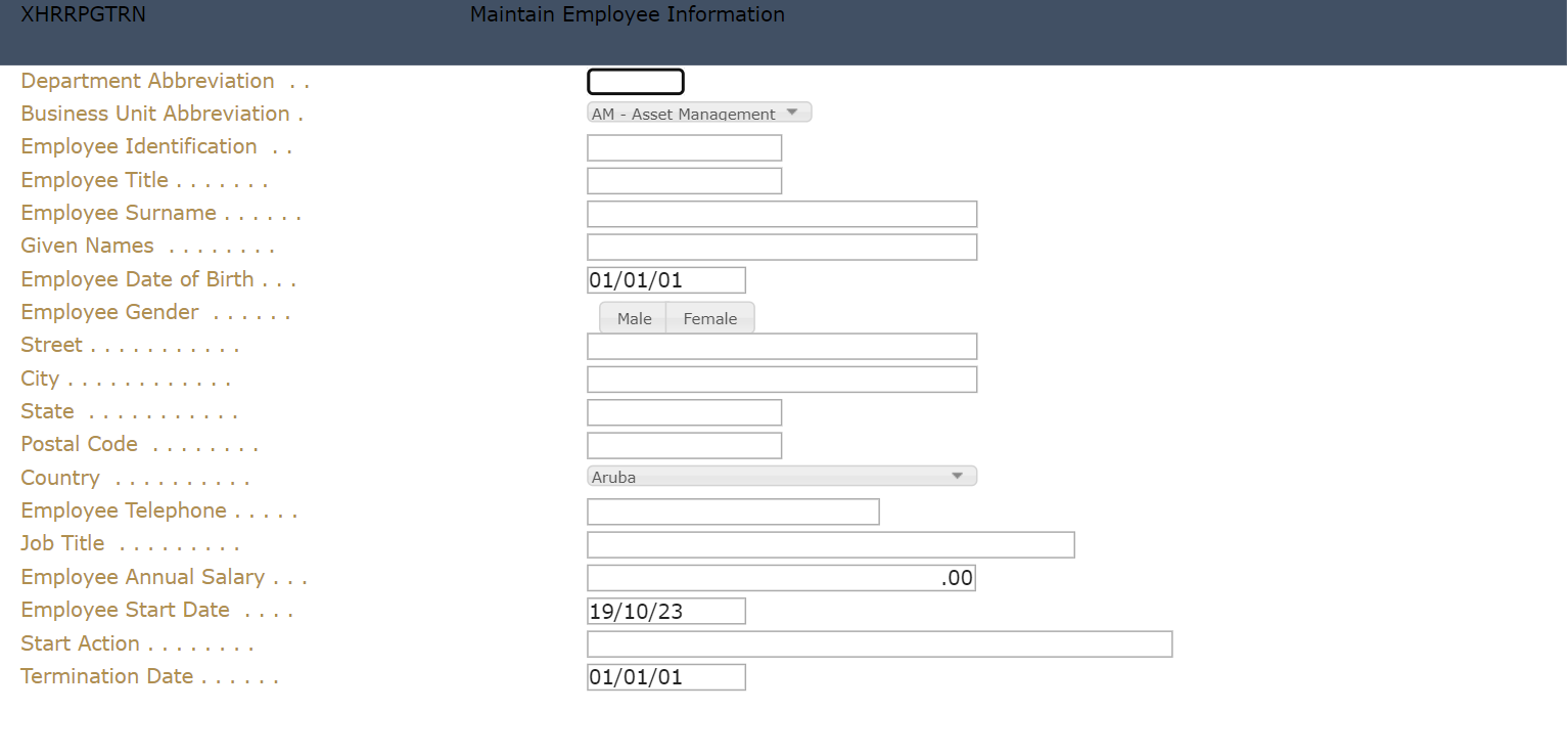
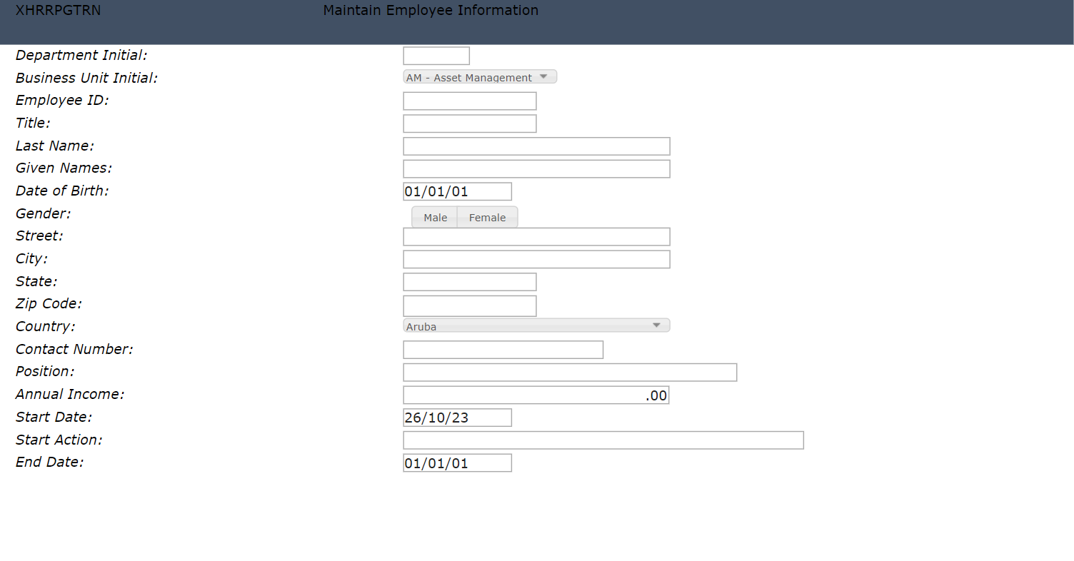
The following example shows how to apply the Label extension to the labels of adding a new employee screen.
Original display:
Updated display:
To do:
1. In Autogui+ window, click button to add a new rule.
2. Set the following rule:
Name: xhrrpgtrn_label
Apply As: Label
3. Click Edit button in the Identification Rules column to open the dialog.
4. Add two rules by clicking button twice.
5. Set the following rules:
[Rule 1]
Position: Target
Field Type: Output
Start row: 3
End row: 21
Start col: 2
End col: 30
[Rule 2]
Position: Right
Diff: 1
Field Type: Input
6. Click OK button to store the changes and close the dialog.
7. Click Edit button in the Properties column to display the eXtension’s properties window.
8. In the eXtensions menu, click Edit Styles button of style property.
9. Set font-style attribute to “italic” then click OK to close the dialog.
10. Click Edit Script button of onScreenReady property and type the following:
// define the label’s text to replace and its sample text replacement
var data = {
"Department Abbreviation" : "Department Initial",
"Business Unit Abbreviation" : "Business Unit Initial",
"Employee Identification" : "Employee ID",
"Employee Title": "Title",
"Employee Surname": "Last Name",
"Employee Date of Birth" : "Date of Birth",
"Employee Gender" : "Gender",
"Postal Code" : "Zip Code",
"Employee Telephone" : "Contact Number",
"Job Title" : "Position",
"Employee Annual Salary" : "Annual Income",
"Employee Start Date" : "Start Date",
"Termination Date" : "End Date"
};
// get the field’s data text
var text = FIELD.getValue();
// remove the dots and spaces in the text
text = text.replace(/\./g, "").trim();
// assign the formatted text to a new variable
var newtext = text;
// loop through the label data
for (var prop in data) {
if (text == prop) {
// if the text is found from the sample data, get its equivalent label
newtext = data[prop];
break;
}
}
// set the new label and add a colon
FIELD.setProperty("text", newtext + ":");
// refresh the field to reflect the change
FIELD.refresh();
11. Click OK button to close the dialog.
12. Click OK button to store the changes and close the Properties window.
13. Click OK button to store the changes and close the Autogui+ window.
14. Click Save button.
15. Log in to your project and go to New Employee screen and confirm the changes has been applied to your project.
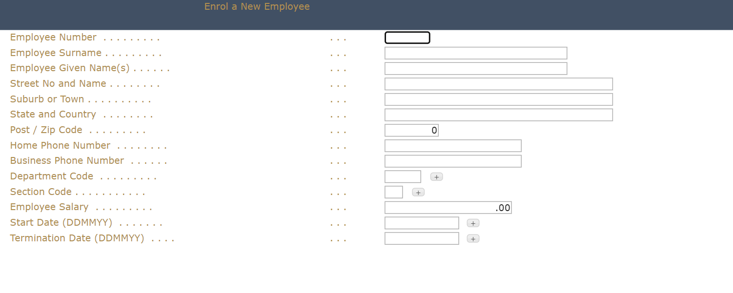
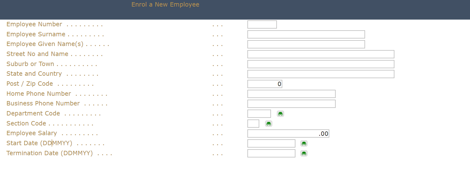
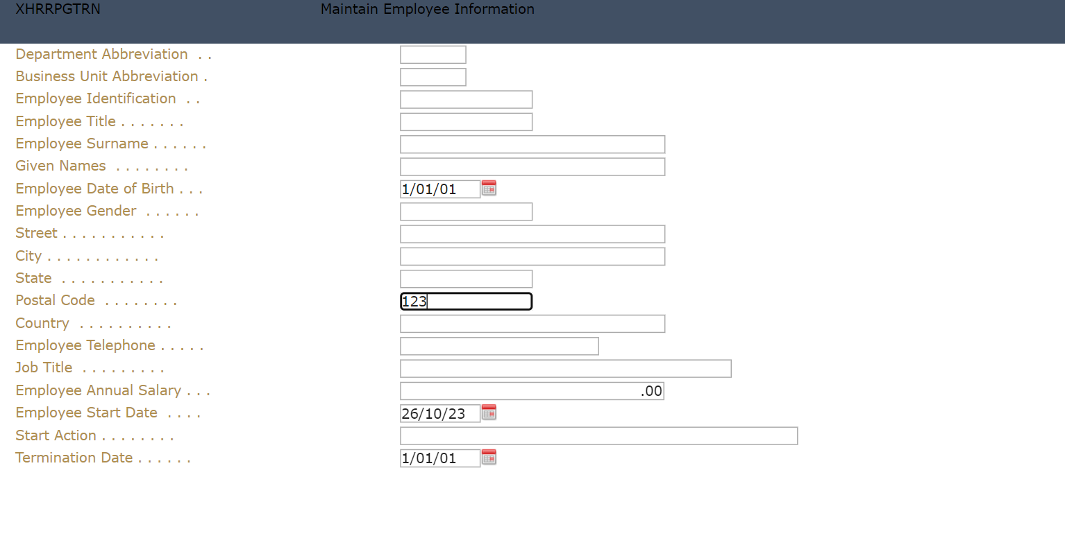
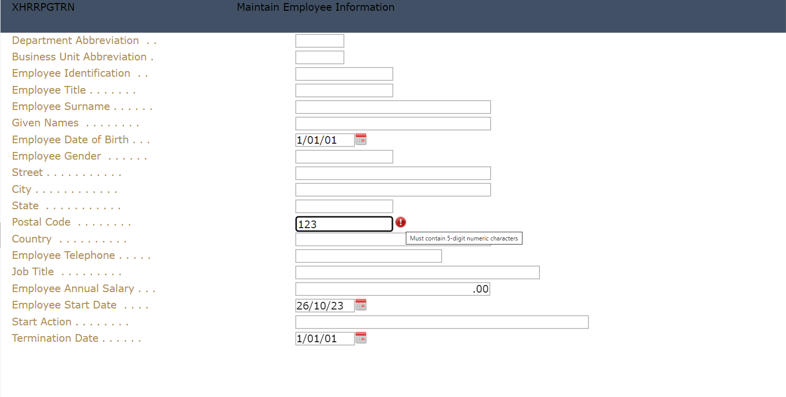
Multitype Input Box
The following example shows how to apply the Multitype Input Box extension to Postal Code input field. This input field will only accept 5-digit numeric characters only and will display a custom message when input is invalid.
Original display:
Updated display:
To do:
1. In Autogui+ window, click button to add a new rule.
2. Set the following rule:
Name: Postal Code
Apply As: Multitype Input Box
3. Click Edit button in the Identification Rules column to open the dialog.
4. Add two rules by clicking button twice.
5. Set the following rules:
[Rule 1]
Position: Target
Field Type: Input
[Rule 2]
Position: Left
Diff: 1
Contains: Postal Code
Field Type: Output
6. Click OK button to store the changes and close the dialog.
7. Click Edit button in the Properties column to display the eXtension’s properties window.
8. In the eXtensions menu, set the following properties:
pattern: ^\d{5}$
validationMessage: Must contain 5-digit numeric characters.
9. Click OK button to store the changes and close the Properties dialog.
10. Click OK button to store the changes and close the Autogui+ window.
11. Click Save button.
12. Log in to your project and go to New Employee screen and confirm the changes has been applied to your project.
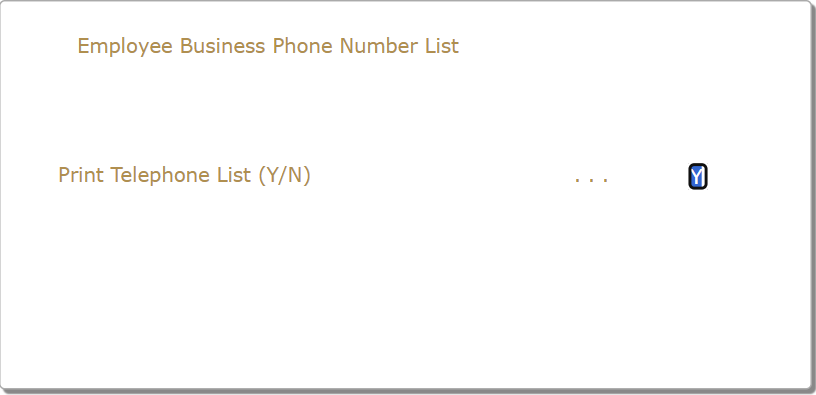
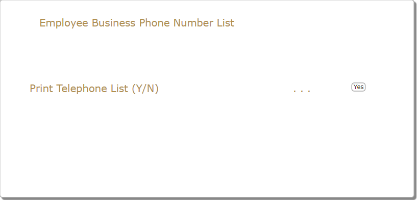
Checkbox
The following example shows how to apply the Checkbox extension to input field that accepts Y or N value.
Original display:
Updated display:
To do:
1. In Autogui+ window, click
2. Set the following rule:
Name: YesNo
Apply As: Checkbox
3. Click Edit button in the Identification Rules column to open the dialog.
4. Add two rules by clicking button twice.
5. Set the following rules:
[Rule 1]
Position: Target
Field Type: Input
Length: 1
[Rule 2]
Position: Left
Diff: 2
Contains: Y/N
Field Type: Output
6. Click OK button to store the changes and close the dialog.
7. Click Edit button in the Properties column to display the eXtension’s properties window.
8. In the Properties menu, click Edit Styles button to open the Edit Styles dialog.
9. Set “8px” to font-size attribute and click OK to store the changes and close the dialog.
10. In the eXtensions menu, set the label property to “Yes”.
11. Click OK button to store the changes and close the Properties dialog.
12. Click OK button to store the changes and close the Autogui+ window.
13. Click Save button.
14. Log in to your project and go to the screen where Y/N input field exists to confirm the changes has been applied.
Raw HTML
This extension allows the user to add an html element such as div or img that will be displayed in all the screens of the application. Since this is not applied to any existing elements, the Contains field in Identification Rules dialog must have a fixed value of “_AX_ONCE_”
The following example shows how to add a logo image and a gif image that acts as a banner for important information.
To do:
1. For the logo, download any image of your choice and name it as logo.png. For the banner, download any gif image or create one using free gif maker websites that animates the text and name it as banner.gif. Then put these images in ts/screens/<private folder>.
2. For the logo, in Autogui+ window, click button to add a new rule.
3. Set the following rule:
Name: Logo
Apply As: Raw HTML
4. Click Edit button in the Identification Rules column to open the dialog.
5. Click button to add a new rule.
6. Set the following rule:
Position: Target
Contains: _AX_ONCE_
7. Click OK button to store the changes and close the dialog.
8. Click Edit button in the Properties column to display the eXtension’s properties window.
9. In the Properties menu, click Edit Styles button to open the Edit Styles dialog.
10. Set the following attributes:
left: 520px
top: 2px
11. Click OK to store the changes and close the dialog.
12. In the eXtensions menu, set “<img style="height:20px" src="/ts/screens/<private folder>/ logo.png">” to html property.
13. Click OK button to store the changes and close the Properties dialog.
14. For the banner, in Autogui+ window, click button to add another rule.
15. Set the following rule:
Name: Banner
Apply As: Raw HTML
16. Click Edit button in the Identification Rules column to open the dialog.
17. Click button to add a new rule.
18. Set the following rule:
Position: Target
Contains: _AX_ONCE_
19. Click OK button to store the changes and close the dialog.
20. Click Edit button in the Properties column to display the eXtension’s properties window.
21. In the Properties menu, click Edit Styles button to open the Edit Styles dialog.
22. Set the following attributes:
height: 20px
left: 300px
top: 410px
23. Click OK to store the changes and close the dialog.
24. In the eXtensions menu, set “<img src="/ts/screens/<private folder>/banner.gif"></img>” to html property.
25. Click OK button to store the changes and close the Properties dialog.
26. Click OK button to store the changes and close the Autogui+ window.
27. Click Save button.
28. Log in to your project and check each screen if the logo and banner are displayed.
Note:
Make sure to change the permission of the downloaded files to:
*PUBLIC *R