Extension Tutorial 17 - Google Chart Tutorial v4.2.2
Contents
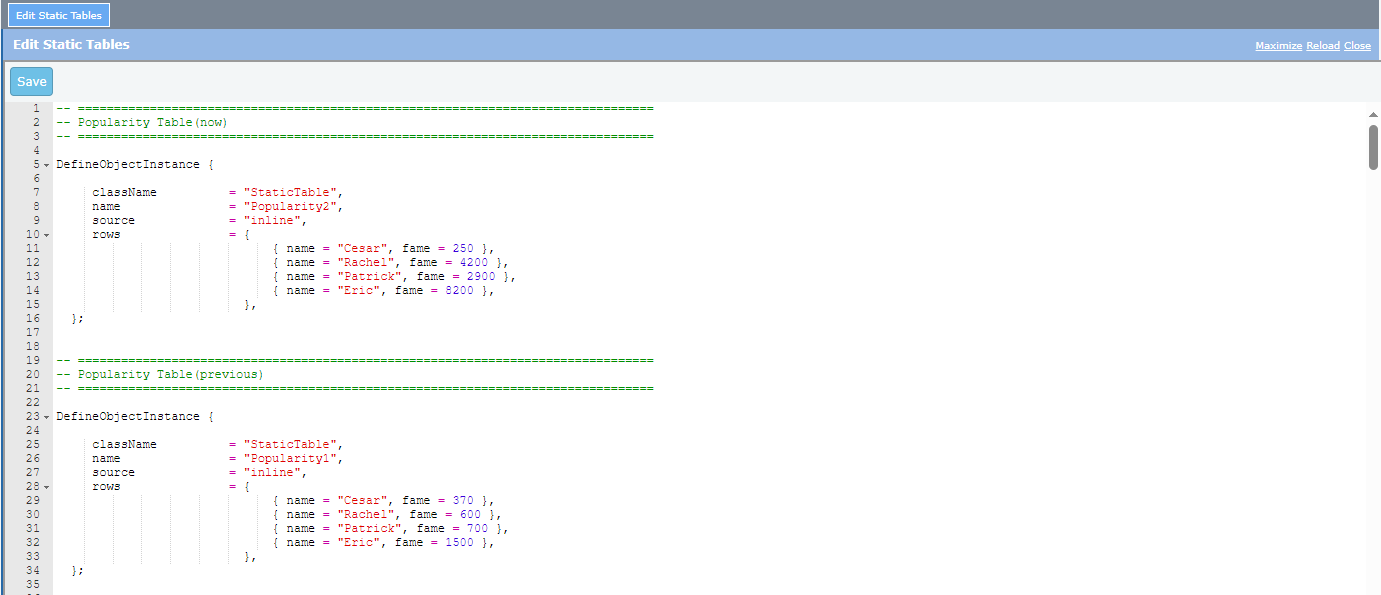
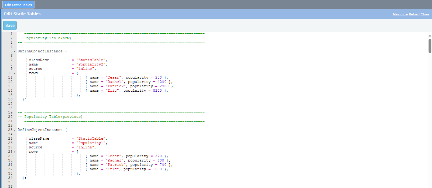
1.1. Define two static tables, the Popularity Table (now) and Popularity Table (previous):
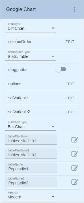
1.2. Add a Google chart extension and set the following properties:
1.3. Add the following script to the options property:
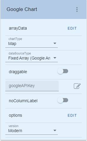
2.1. Add a Google chart extension and set the following properties:
2.2. Add the following script (or an equivalent) to the arrayData property:
2.3. Add the following script to the options property:
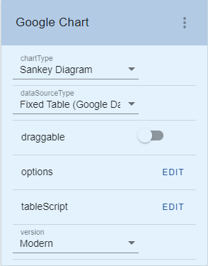
3.1. Add a Google chart extension and set the following properties:
3.2. Add the following script to the options property:
3.3. Add the following script to the tableScript property:
4.1. Add a Google chart extension and set the following properties:
4.2. Add the following string to the url property:
4.3. Add the following string to the options property:
5.1. Add a Google chart extension and set the following properties:
5.2. Add the following script to the options property:
5.3. Add the following script to the arrayData property:
5.4 Check the noColumnLabel property:
6.1 Check or enable the draggable property:
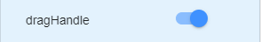
6.2 Check or enable the dragHandle property:
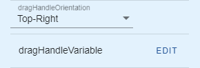
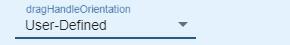
6.3 Set the dragHandleOrientation property to:
6.4 Set the script of the dragHandleVariable property to:
1.1. Define two static tables, the Popularity Table (now) and Popularity Table (previous):
--
1.2. Add a Google chart extension and set the following properties:
Note that the columnOrder property should be:
ENV.returnValue = ["name", "fame"];
(Static
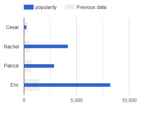
Table data which generated the Diff chart is courtesy of Google.) The resulting chart is a rendering of a bar graph showing the current and the
previous popularity data of persons. As for the usage of the XML file data source, just like in the dropdown extension,
the user of an Axes developer would depend on the XML filename and the
directory where the file resides. Also,
in the documentation of the dropdown extension, there is a data source type
called “Fixed Values”. In this extension, the same thing is called “Fixed Array
(Google Array Format)” and “Fixed Table (Google DataTable Script)”; these 2 new
data source types are of Google’s flavour because this extension is bound to
follow Google’s rules. According
to the Google developer website https://developers.google.com/chart/interactive/docs/datatables_dataviews#arraytodatatable an
array in the format of
[ <row 1 data>, <row 2 data>, <row 3 data>… <row N
data> ] where
a row data represents a table row, will produce a graph if this array is passed
as a parameter to the
google.visualization.arrayToDataTable() API
and the resulting value is passed as the data parameter to the chart() API of
an instantiated chart object. An example illustrating the usage for the fixed array data source is given in the
following steps.
ENV.returnValue = [ [ "地名", "テキスト" ], [
"秦野駅", "地元!!!" ], [
"東武練馬駅", "自宅!!!" ], [
"浅草橋3-1-8", "職場!!!" ] ];
Note that the texts in the script follow the <place, comment> row format.
Hence, to create data for a more general
audience, specific values can be made in the form of [ [“name of
place”, “comment”], [place
#1, comment #1], [place
#2, comment #2],
[place #3, comment #3] ] replacing
places and comments with actual place names and remark texts in
quotes. ENV.returnValue = { mapType:
‘normal’, showTip:
true };
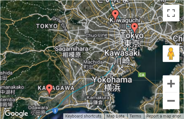
The
chart shows a map in Japan with red markers to the 3 place names just defined
in the arrayData property. Note:
Set the zoom setting in the upper-right hand corner of the screen to 100% to be able to display the tooltip when mouse is hover on the red marker.
As
for the fixed table data source type, according to the Google website https://developers.google.com/chart/interactive/docs/datatables_dataviews#emptytable a
DataTable object can be instantiated, column names and types can be defined,
and the object data can be populated in a scripting manner. Thus, this
DataTable object becomes the data source for this type. An
example illustrating the usage for the fixed table data source is given in the
following steps.
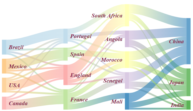
ENV.returnValue = {
"sankey": {
"node": {
"colors": [ "#a6cee3", "#b2df8a",
"#fb9a99", "#fdbf6f", "#cab2d6",
"#ffff99", "#1f78b4", "#33a02c" ],
"label" : { "bold": true, "color":
"#871b47", "fontName": "Times-Roman",
"fontSize": 14, "italic": true } }, "link": {
"colorMode": "gradient",
"colors": [ "#a6cee3", "#b2df8a",
"#fb9a99", "#fdbf6f", "#cab2d6",
"#ffff99", "#1f78b4", "#33a02c" ] } } }; var data = new google.visualization.DataTable(); data.addColumn(
'string', 'From' ); data.addColumn(
'string', 'To' ); data.addColumn(
'number', 'Weight' ); data.addRows( [ [ 'Brazil',
'Portugal', 5 ], [ 'Brazil',
'France', 1 ], [ 'Brazil', 'Spain',
1 ], [ 'Brazil',
'England', 1 ], [ 'Canada',
'Portugal', 1 ], [ 'Canada',
'France', 5 ], [ 'Canada',
'England', 1 ], [ 'Mexico',
'Portugal', 1 ], [ 'Mexico',
'France', 1 ], [ 'Mexico',
'Spain', 5 ], [ 'Mexico',
'England', 1 ], [ 'USA',
'Portugal', 1 ], [ 'USA',
'France', 1 ], [ 'USA',
'Spain', 1 ], [ 'USA',
'England', 5 ], [ 'Portugal', 'Angola',
2 ], [ 'Portugal',
'Senegal', 1 ], [ 'Portugal',
'Morocco', 1 ], [ 'Portugal',
'South Africa', 3 ], [ 'France',
'Angola', 1 ], [ 'France',
'Senegal', 3 ], [ 'France',
'Mali', 3 ], [ 'France',
'Morocco', 3 ], [ 'France',
'South Africa', 1 ], [ 'Spain',
'Senegal', 1 ], [ 'Spain',
'Morocco', 3 ], [ 'Spain',
'South Africa', 1 ], [ 'England',
'Angola', 1 ], [ 'England',
'Senegal', 1 ], [ 'England',
'Morocco', 2 ], [ 'England',
'South Africa', 7 ], [ 'South Africa',
'China', 5 ], [ 'South Africa',
'India', 1 ], [ 'South Africa',
'Japan', 3 ], [ 'Angola',
'China', 5 ], [ 'Angola',
'India', 1 ], [ 'Angola',
'Japan', 3 ], [ 'Senegal',
'China', 5 ], [ 'Senegal',
'India', 1 ], [ 'Senegal',
'Japan', 3 ], [ 'Mali',
'China', 5 ], [ 'Mali',
'India', 1 ], [ 'Mali',
'Japan', 3 ], [ 'Morocco',
'China', 5 ], [ 'Morocco',
'India', 1 ], [ 'Morocco',
'Japan', 3 ] ] ); ENV.returnValue
= data;
(Fixed
Table script which generated the Sankey chart is courtesy of Google.) A
backgrounder from Google: A
sankey diagram is a visualization used to depict a flow from one set of values
to another. The things being connected are called nodes and the connections are
called links. Sankeys are best used when you want to show a many-to-many
mapping between two domains (e.g., universities and majors) or multiple paths
through a set of stages (for instance, Google Analytics uses sankeys to show
how traffic flows from pages to other pages on your web site). For
the curious, they're named after Captain Sankey, who created a diagram of steam
engine efficiency that used arrows having widths proportional to heat loss. Another
new data source type that is introduced to Axes in this extension is the usage
for the Google Data Query. In this usage, a user of the Axes developer only
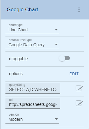
needs to define a URL and a query string for a known datasource web service. An
example illustrating this usage is given in the following steps.
queryString:
SELECT A,D WHERE D > 100 ORDER BY D
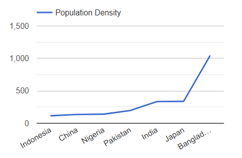
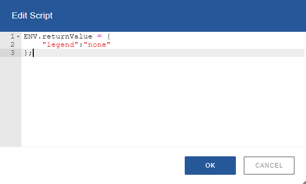
http://spreadsheets.google.com/tq?key=pCQbetd-CptGXxxQIG7VFIQ&pub=1 ENV.returnValue = { legend: 'top', hAxis: {
slantedText: true } };
(Values
for the url and the queryString properties which generated the Line chart is
courtesy of Google.)
The chart above shows the population density. So, if the datasource web service
in this example updates their data instantaneously, that means that the
extension is displaying a graph with real-time data. Note:
Set the zoom setting in the upper-right hand corner of the screen to 100% to be
able to display the tooltip when mouse is hover on the point in the chart. arrayData2,
directory2, filename2, queryString2, sqlVariable2, tableFilename2, tableName2,
tableScript2, url2 properties The
illustration in example 1 which explains how to use the static table data
source type gives a hint on the usage of the tableName2
property. And in the example, the chartType value is “Diff
Chart”. Therefore, the usage for the other properties which are arrayData2, directory2, filename2, queryString2, sqlVariable2, tableFilename2, tableScript2, and url2 will have meaning
only when the chartType value is also “Diff
Chart”. The arrayData2 property is the
counterpart of the arrayData property when the
data source type is “Fixed Array (Google Array Format)”, and so on and so
forth… columnOrder property The
columnOrder property is
applicable when the data source type is “Dynamic Table”, “Static Table”, or
“XML File”. The purpose of this property is to allow the user to identify which
column data is first, which is next to it, etc., because the extension has no
way to know which is which. If this is not specified, the extension will
default to the alphabetical order of column names. Revisiting
the example 1 about the usage for the static table data source type, note that
the “name” and the “popularity” labels defined in the static tables from step
1.1 can be assigned arbitrarily by the user. With a wrong column name ordering,
this may lead to error in chart rendering which cannot be debugged at the
extension level. To
illustrate this scenario, change all the “popularity” string to “fame” in the 2
tables. The new table definitions will become:
Save
and close the file; reload the project. The new rendering of the chart extension will become:
To
rectify this situation, there is a need to adjust the label ordering by setting
the columnOrder property to:
This
means that the “name” string is set as the first column label, and the “fame”
as the next column label. If the “fame” label is set as the first column label,
for example,
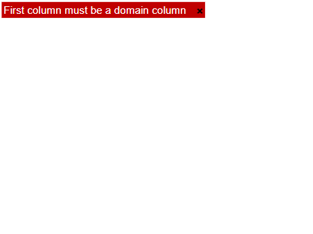
[ “fame”, “name” ], it
will lead to the same rendering error shown previously, popping the “First
column must be a domain column” message, since the columnOrder property is not specified and the default
behaviour is to sort out the columns names resulting to an array with “fame” as
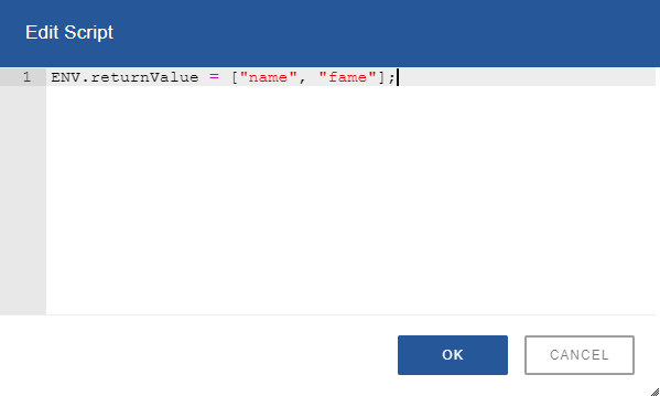
the first element. After
clicking the OK button in the edit script dialog, the chart extension
immediately will result to the expected output:
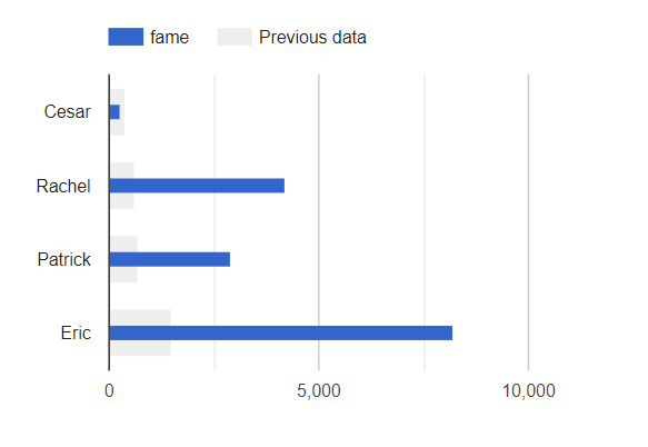
Notice
that the legend name representing the blue bar is changed from “popularity” to
“fame”. noColumnLabel property The
noColumnLabel property is
applicable when the data source type is “Fixed Array (Google Array Format)”, or
“Static Table”. With these data sources, a user can define an array data where
the first row is actually a row data which do not represent column labels.
Checking this property lets the extension know that this is the case. An
example illustrating the noColumnLabel property is given in
the following steps.
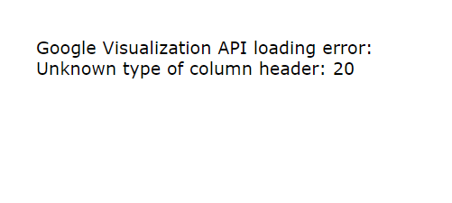
ENV.returnValue
= [ [
"Mon", 20, 28, 38, 45 ], [
"Tue", 31, 38, 55, 66 ], [
"Wed", 50, 55, 77, 80 ], [
"Thu", 77, 77, 66, 50 ], [
"Fri", 68, 66, 22, 15 ] ]; Click
the OK button in the edit script dialog above, and unlock the screen to show
the output, the chart extension will display:
The
reason for this error is that, in the array values just set to arrayData property, the first row data is of the same
kind with the rest of the data. In other words, it does not represent the
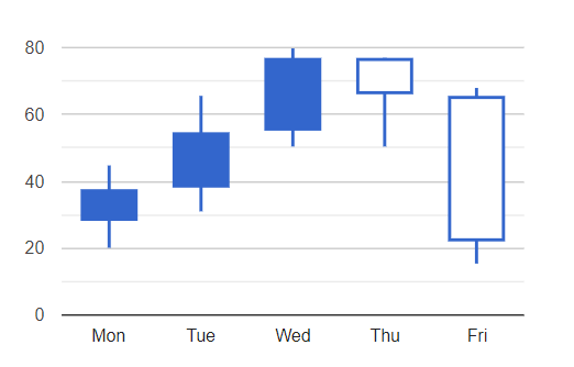
column labels. To correct the situation, simply and
immediately, the chart extension will become:
(Fixed
array values which generated the Candlestick chart is courtesy of Google.) A
backgrounder from Google: A
candlestick chart is used to show an opening and closing value overlaid on top
of a total variance. Candlestick charts are often used to show stock value
behavior. In this chart, items where the opening value is less than the closing
value (a gain) are drawn as filled boxes, and items where the opening value is
more than the closing value (a loss) are drawn as hollow boxes. options property The
options property is the key to the styling of
a Google Visualization chart. Familiarize each of the charts to learn what
properties and behaviour that are applicable to each one. draggable,
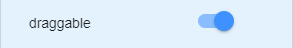
dragHandle, dragHandleOrientation, dragHandleVariable properties The
draggable property enables the placement of the
extension be changed by mouse movement. If
a user wants the extension to be moved only by dragging in a specific portion
of it, then the dragHandle property should be
set. With a checked dragHandle property, the user is
given a default drag handle with a given characteristics: - light-blue
color - size of 20px by
50px (height x width)
- offset margin of 10px both from the top side and from the right side These
characteristics is modifiable by changing the values of the dragHandleVariable property. The
dragHandleOrientation property which has a
default value of “Top-Right” can also be set to other values which are: “Top”,
“Top-Left”, “Right”, “Bottom-Right”, “Bottom”, “Bottom-Left”, “Left”, “Center”,
“User-Defined” The
reason for the drag handle is because there are some charts which allow
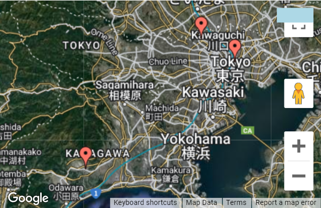
browsing to its content portions. A good example is the map. By dragging a
portion of the map, browsing to the other map coordinates not shown previously
is possible without moving the chart position. Without this drag handle, map
browsing cannot be done when the draggable property is checked
or enabled. As
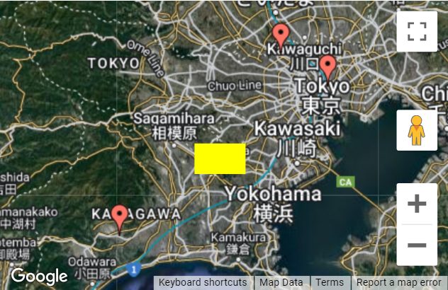
an illustration for the dragHandle property, revisit the
map project in example 2. Dragging a map portion will change the view to other
coordinates depending on the direction of the dragging action.
Immediately,
the dragHandle property will be
added to the extension property pane. Dragging
a map portion gives a different result at this time because the whole chart
area will be moved. Since this new behaviour is not the desired output,
Immediately,
2 complimentary properties, namely, dragHandleOrientation
and dragHandleVariable, will be added to the extension property
pane.
Simultaneously,
the chart extension will become:
The
added portion in light-blue color inside the chart extension is how the default
drag handle looks like. Moving the mouse icon to the light-blue area will turn
it from the grab icon
Clicking
the OK button of the edit script dialog, the chart extension immediately will
become:
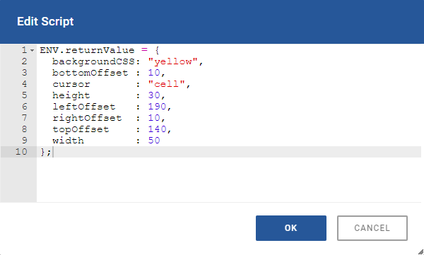
The
characteristics of the drag handle becomes yellow in color, 50px by 30px in
size, and (190px, 140px) in (left, top) location. Hovering the mouse to the
drag handle area will turn the grab icon In
the dragHandleVariable property variable
there are 4 offset margin parameters, namely, bottomOffset, leftOffset,
rightOffset and topOffset. Listed below are the dependencies of these
parameters to the values of the dragHandleOrientation
property. Top
: topOffset Top-Left :
leftOffset, topOffset Right
: rightOffset Bottom-Right:
bottomOffset, rightOffset Bottom :
bottomOffset Bottom-Left :
bottomOffset, leftOffset Left
: leftOffset Center :
none
User-Defined : leftOffset, topOffset This
means that only parameters with dependencies will have effect on the setting of
the dragHandleOrientation property. Notice that
there is no dependency with the “Center” as value for the dragHandleOrientation property simply because there is only
one center location. Note that setting the value of the dragHandleOrientation property from Top-Left to User-Defined
(or vise versa) have no significant effect because both have the same
dependency parameters which are leftOffset and topOffset. Google Visualization
Charts https://developers.google.com/chart/interactive/docs/ Terms of Service:
https://developers.google.com/chart/terms Google Array Format https://developers.google.com/chart/interactive/docs/datatables_dataviews#arraytodatatable DataTable Scripting https://developers.google.com/chart/interactive/docs/datatables_dataviews#emptytable draw() API https://developers.google.com/chart/interactive/docs/drawing_charts#chart.draw computeDiff() API
https://developers.google.com/chart/interactive/docs/gallery/diffchart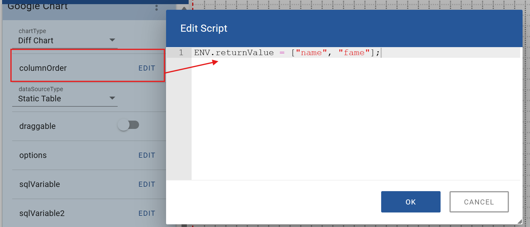
1.3. Add the following script to the options
property:

1.4. After clicking the OK button in the edit
script dialog, the chart extension immediately will become:
2.1. Add a Google chart extension and set the
following properties:
2.2. Add the following script (or an equivalent) to
the arrayData property:
2.3. Add the following script to the options
property:
2.4. After clicking the OK button in the edit
script dialog, the chart extension immediately will become:
3.1. Add a Google chart extension and set the
following properties:
3.2. Add the following script to the options
property:
3.3. Add the following script to the tableScript
property:
3.4. After clicking the OK button in the edit
script dialog, the chart extension immediately will become:
4.1. Add a Google chart extension and set the
following properties:
4.2. Add the following string to the url
property:
4.3. Add the following string to the options
property:
4.4. After clicking the OK button in the edit
script dialog, the chart extension immediately will become:
5.1. Add a Google chart extension and set the
following properties:
5.2. Add the following script to the options
property:
5.3. Add the following script to the arrayData
property:
5.4 Check the noColumnLabel property:
6.1 Check or enable the draggable property:
6.2 Check or enable the dragHandle property:
![]() to the move icon
to the move icon ![]() . Dragging from the
drag handle area will move the whole chart extension. Dragging from other
portions of the map will allow browsing to the rest of map coordinates.
. Dragging from the
drag handle area will move the whole chart extension. Dragging from other
portions of the map will allow browsing to the rest of map coordinates.6.3 Set the dragHandleOrientation property to:
6.4 Set the script of the dragHandleVariable property
to:
![]() to the cell icon
to the cell icon ![]() .
.URLs