Setting Styles Dynamically – Basic Concepts
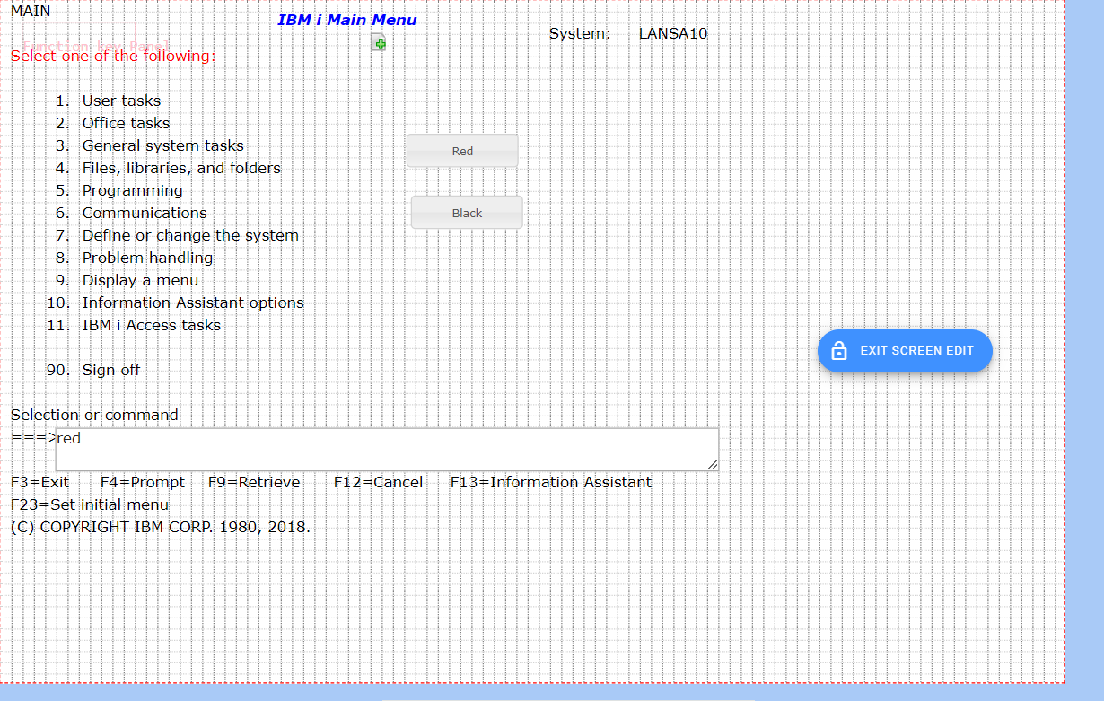
The starting point for this example is the IBM i Main Menu, where:
v The 5250 screen is named MAINMENU
v The selection or command field is named CommandLine.
v Two push button eXtensions, captioned Red and Black, have been added.
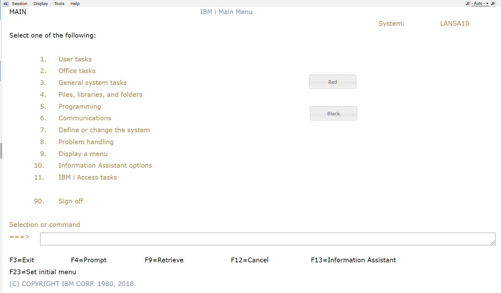
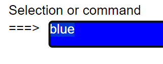
The onClick property of the Red push button is set to this:
var oStyle = { "color":"yellow", "background-color":"red" };
var cmdfld= FIELDS("CommandLine");
cmdfld.setProperty("axdv.style",oStyle);
cmdfld.refresh();
The onClick property of the Black push button is set to this:
var oStyle = new Object();
oStyle["color"] = "white";
oStyle["background-color"] = "black";
var cmdfld= FIELDS("CommandLine");
cmdfld.setProperty("axdv.style",oStyle);
cmdfld.refresh();
These button-click scripts first create a script object (named oStyle here) that specifies a text color and a background color.
Next they get a reference to the field CommandLine on the screen and alter its style (in fact the style of axdv - its default visualization).
Finally the command line field is then instructed to refresh its visualization.
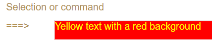
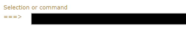
If you click the Red button the command line entry field should look like this:
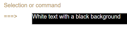
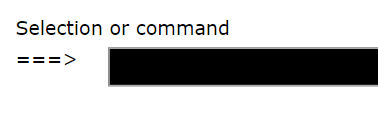
If you click the Black button the command line entry field should look like this:
In eXtension scripting styles are defined in JavaScript objects.
So to create a style dynamically you could code this:
var oStyle = { "color":"yellow", "background-color":"red" };
or you could code this - which may be more familiar:
var oStyle = new Object();
oStyle["color"] = "white";
oStyle["background-color"] = "black";
Note: The style element names like color and background-color that you use are identical to those you see when you set up a style and correspond to the standard CSS style names. They are case-sensitive names.
Both these style object construction techniques are functionally identical, but the second technique generally makes it easier to put if/else logic into the set up.
You can also mix and match the techniques like this:
var oStyle = { "background-color":"red" };
if (condition) oStyle["color"] = "white";
else oStyle["color"] = "palestraw";
Setting Styles Dynamically – Self Styling
The preceding Basic Concepts example uses two push buttons to alter the style of the command line. This is typical of the situation where a user’s action like clicking the Save button may cause screen elements to change their style.
Another way to style screen style elements is to let them style themselves. This is only applicable to TS 1.
Typically they do this by looking at their own content and style themselves to attract the user’s attention.
For example, a YES/NO field related to whether a customer should be extended more credit might change itself to red when it contains NO.
Self-styling can be demonstrated by altering the example started in the preceding Basic Concepts section as follows.
First, the CommandLine field is selected, and the Style property of its Default Visualization is changed to be evaluated by executing script:
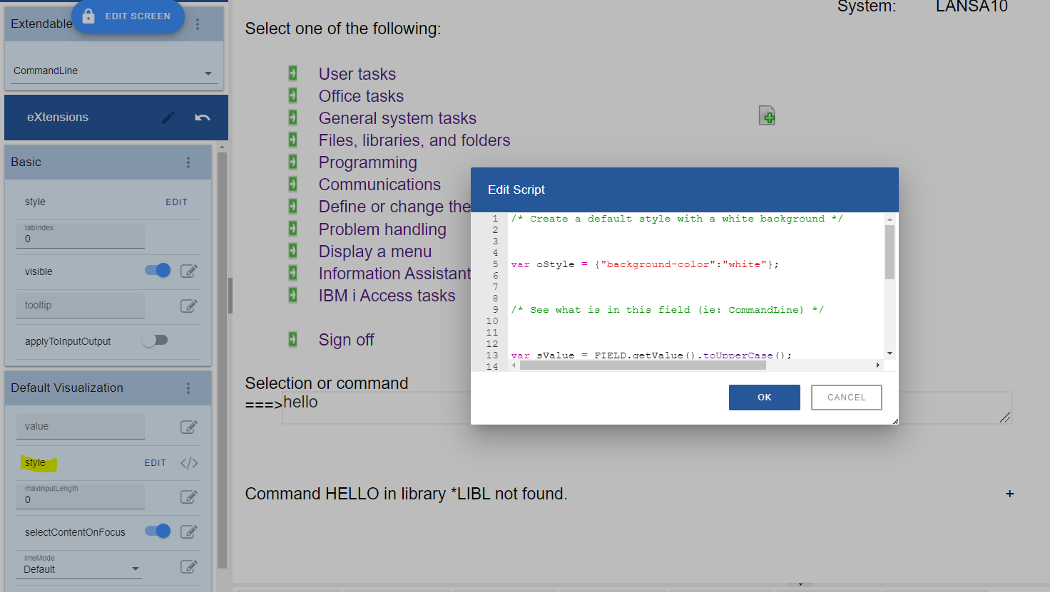
Where the script used is like this:
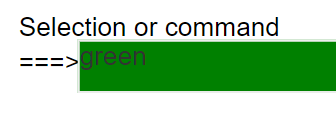
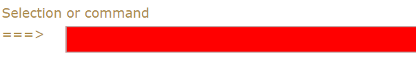
/* Create a default style with a white background */
var oStyle = {"background-color":"white"};
/* See what is in this field (ie: CommandLine) */
var sValue = FIELD.getValue().toUpperCase();
/* If it contains blue or green make it the background color */
if ((sValue == "BLUE") || (sValue == "GREEN")) oStyle["background-color"] = sValue;
/* Return the style object to be used for this field (ie: CommandLine) */
ENV.returnValue = oStyle;
This change is saved and then the IBM i Main Menu is executed.
If you type the word green or blue into the command line and press enter (or any key that causes the screen to be redisplayed by the server), you should see the style change like this:
Or like this:
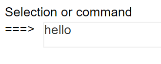
Type anything else into the command area and the default background color of white will be used:
For TS2, since the Style property of the element does not allow script (only through list of attributes or JSON format) to style themselves, you can put the above code in screen event like onArrive or in button’s onClick event or any other event that must be triggered.
Setting Styles Dynamically – Using the USERENV object
The preceding Basic Concepts example used hard-coded style elements for the color and background color.
By using the USERENV object you can centralize and abstract style logic.
First, edit your USERENV object.
Add the highlighted code:
var USERENV =
{
REDStyle : { "color" : "yellow", "background-color" : "red" },
BLACKStyle : { "color" : "white", "background-color" : "black" },
This code defines new objects USERENV.REDStyle and USERENV.BLACKStyle.
Save your USERENV object changes. Then start a new aXes developer session to make sure you pick up the modified USERENV.JS file.
Change the onClick property of the Red push button to this:
var cmdfld= FIELDS("CommandLine");
cmdfld.setProperty("axdv.style",USERENV.REDStyle);
cmdfld.refresh();
Change the onClick property of the Black push button to this:
var cmdfld= FIELDS("CommandLine");
cmdfld.setProperty("axdv.style",USERENV.BLACKStyle);
cmdfld.refresh();
It's worth noting this about this new code:
· USERENV.REDStyle and USERENV.BLACKStyle are defined in one place. Where many scripts refer to them this makes changing them much simpler.
· This code version is marginally more efficient. The original version had to repeatedly create style objects. This version just refers to a pre-existing style - eliminating the cost of creating objects.
· Using style names like RED and BLACK is not recommended - but they suit the purpose of making this example simple.
In a real application your style names should generally not reflect the physical characteristics of the style, such as its color.
Instead they should reflect its role - like EMPHASIZED or ERROR. Using the role-based approach abstracts the definition of how an ERROR is actually visualized away from individual scripts.
· You can probably start to see how you can reduce your scripting even more by putting progressively more compound functions into the USERENV object.
You should be able to reduce the scripting required for the Red button to a single line like this:
USERENV.setStyle("CommandLine",USERENV.REDStyle);
And to this for the black button:
USERENV.setStyle("CommandLine",USERENV.BLACKStyle);
Setting Styles Dynamically – Using Application Styles/Themes
The preceding Basic Concepts example used hard-coded style elements for the color and background color.
A better solution may be to use application level styles.
This approach also allows the styles to be dynamically themed.
If the application level styles named RedBoard and BlackBoard are defined as:
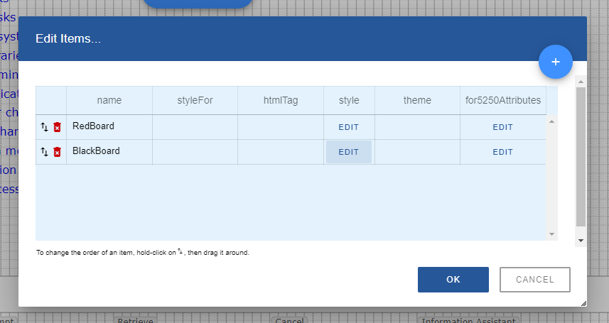
Then the code for the Red button could be changed to this better code:
var oStyle = { _base : "RedBoard" };
var cmdfld= FIELDS("CommandLine");
cmdfld.setProperty("axdv.style",oStyle);
cmdfld.refresh();

and for the black button:
var cmdfld= FIELDS("CommandLine");
cmdfld.setProperty("axdv.style", { _base : "BlackBoard" } );
cmdfld.refresh();
Here the special property _base in the style object is used to specify the application level style name.
Generally using an application level style is better because it centralizes the definition of the style and it performs slightly better.
Understanding Screen Sizing and the Thin Red Line
aXes is designed to display 5250 screens, which are typically 24x80 or 27x132 lines of characters/columns. By default, aXes will display an area that represents this type of screen size (also see the next section about row/column size to understand how the default 5250 screen size is calculated).
When enhancing screens you can create more screen space - but before doing this it is best to understand how the screen sizing process works.
Display the IBM i Main Menu (named MAIN).
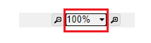
Set the aXes zoom factor to 100% using the drop-down in the right top corner of the screen.
Stretch the browser window out so that what you are seeing is much larger than the 5250 screen display area.
Put the screen in edit mode by clicking on Lock Screen icon.
Initially, the area inside the thin red line represents the "5250 size" of this screen.
In TS2, you can no longer position the elements beyond the thin red line.
However, you can make more space on enhanced 5250 screens.
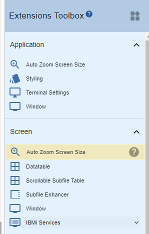
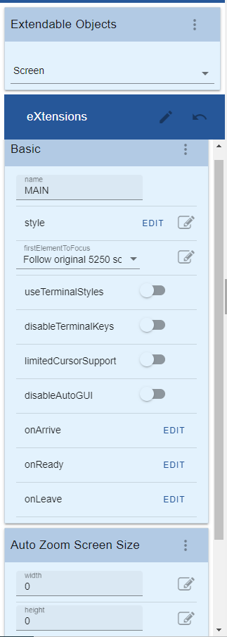
Select the Auto Zoom Screen Size extension from Extension Toolbox then drag and drop it onto the screen panel.
Then the screen customization window will now look like this:
The width and height properties of the Auto Zoom Screen Size extension allow you to specify the logical dimensions of this enhanced screen. In effect these properties allow you to move the thin red line boundary.
Specify width and height properties, something like this:
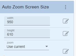
Note: These values are logical sizes, in pixels. It does not mean you have to have a screen that wide or high to display the screen. The auto zoom feature will zoom your screen in or out to fit the available browser display space at any time, no matter how large or how small it is. Refer to Screen Size documentation for the description of other properties such as zoom and lock zoom.
You should be able to move the boundaries out, something like this:
Save your screen changes.
Navigate off this screen and back again to make sure the sizing information is reset, properly.
Now start changing the  screen zoom setting again.
You should also try logging on to aXes as a user and checking your screen there when using various zoom sizes.
You should find that your "big" 5250 screen is correctly visible at all zoom sizes, particularly the Auto and Fit sizes.
There are some important things to note:
1. Do not make the boundaries smaller than the 5250 screen default size. This is not supported in any form. Note that the 5250 screen boundaries will depend on whether the 5250 displayed screen is 24x80 or 27x132.
2. You can make your screen very wide and very high, but as you do this the real 5250 screen area will proportionally shrink. If it shrinks too much users may not be able to read it and the screen caret may stop displaying correctly.
3. Try to avoid a plethora of different "big" screen sizes. Decide on a single "big" screen size, or on a small standard set of them. Use them selectively.
A simple way to do this is to change the defaults for the Auto Screen Size's height and width properties. Then all a developer needs to do is check the Auto Screen Size eXtension to get the correct default "big" screen size.
Alternatively, the Auto Zoom Screen Size property values could be set by invoking a USERENV function like USERENV.iscreenHeight("medium"), USERENV.iscreenHeight("large") and USERENV.iscreenHeight("xlarge"). This would allow 3 "big" screen sizes to be centrally defined.
Using wide screens (132 x 27)
When you have 5250 wide screens you should design and execute your applications in widescreen mode.
In effect, any 24x80 mode of operation that your application may support would no longer be used when it is displayed by aXes.
Using Extended/Enhanced 5250 DDS attributes
5250 DDS sometimes contain extended/enhanced DDS attributes to display fields as radio buttons, drop downs, etc in the limited range of products that support the options.
aXes supports these extended/enhanced DDS options - but you should not add eXtensions to such screens as the GUI capabilities are different and contradictory.
Leave the screens to be displayed natively by aXes, but do not add eXtensions to them.
Changing 5250 Row / Column Size
By default rows in AXES 5250 screens will be 15 pixel high and columns will be 8 pixel wide.
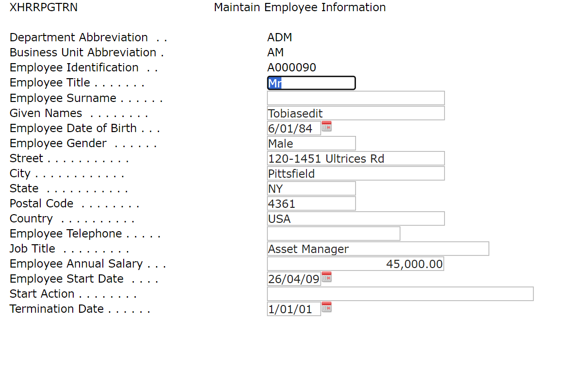
If for some reason you decided to use a larger font and changed the global style font to Verdana, 12pt, your screen will look similar to the one below:
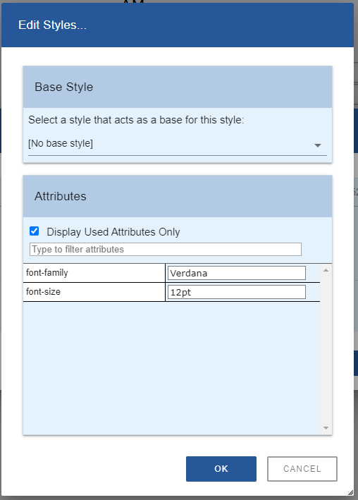
Reminder: you need to set the useTerminalStyles property of this screen to false to allow custom styles to take effect.
You can see in the screenshot above that the edit boxes adjust according to the specified font size.
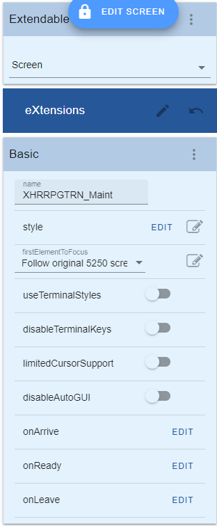
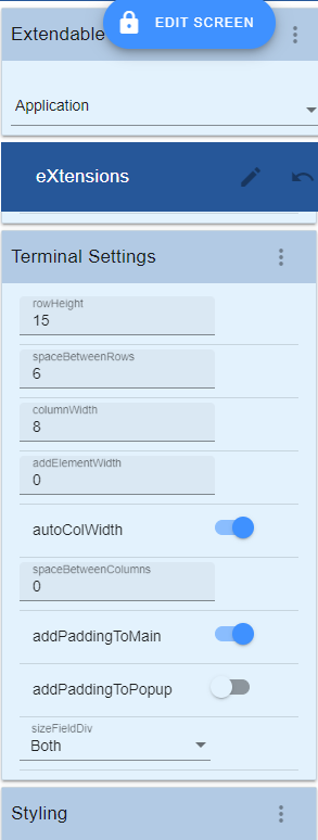
Use an application-level eXtension Terminal Settings to allow you to easily change the default height of rows in 5250 screens.
Follow these steps to use this eXtension:
· Go to the aXes Developer window.
· Lock the screen to switch to edit mode.
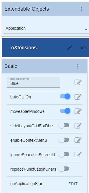
· Select Application from the Extendable Objects dropdown to view the Application Properties.
· Even if you have never customized a screen before, the Application Terminal Settings eXtension is already included in the Application Properties.
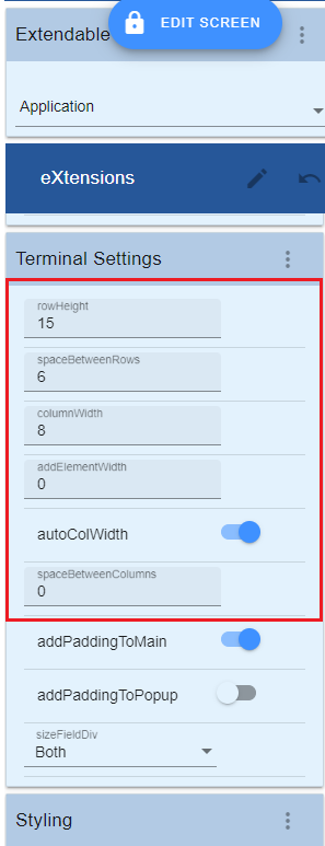
The value of the Terminal Settings properties in the property sheet is default.
<< TODO Update this part!>>
Set the rowHeight to 25 and spaceBetweenRows to 5. Save the settings (click the Save button at the top of the window). You will see your screen changes immediately to the one below:
About Fonts and Font Sizes
We recommend that you do not change fonts or font sizes via shipped style sheets or use customized style sheets to change fonts or font sizes.
If you change a style sheet you may need to clear your browser cache to get the changes.
We also recommend that you do not use variable width fonts on un-customized screens because somewhere down the track you will encounter a problem on a screen with subfile content or headings that appear to become misaligned.
— In Arial, compare the widths:
WWWWW
IIIII
The string of W's is almost 3 times as wide as the I's.
— In Lucida Console, compare the widths:
WWWWW
IIIII
They are the same width.
This is the essence of the variable width/pitch font problem.
— If an RPG program puts out these subfile headings as a single text output field:
Customer Product Order Quantity Value
18181818 6373737 8484848 700 1,234.56
18181818 6373737 8484848 700 1,234.56
You may end up with a display like this, when using a variable width font:
Customer Product Order Quantity Value
18181818 6373737 8484848 700 1,234.56
18181818 6373737 8484848 700 1,234.56
There is no resolution here. The 5250 DDS output strings …
'Customer Product Order Quantity Value' (in Lucida Console)
'Customer Product Order Quantity Value' (in Arial)
are exactly the same length – they simply have different display lengths.
If the program also outputs the subfile data columns as one long field instead of as individual fields (as some do) then the problem is even more exacerbated:
Customer Product Order Quantity Value
1123 BOLTS 8484848 3 4.56
1123 NUTS 8484848 700 1,234.56
1123 HAMMER 8272 2000 11,234.56
Customer Product Order Quantity Value
1123 BOLTS 8484848 3 4.56
1123 NUTS 8484848 700 1,234.56
1123 HAMMER 8272 2000 11,234.56
— To change fonts or font sizes use the application definition eXtension. See Tutorial 7 – Themes. Changes you make to fonts and font sizes here may be applied to customized and non-customized screens.
— A 5250 screen is inherently a fixed width device which uses fixed width characters. A 5250 screen has 24 x 80 or 27 x 132 fixed width and height cells that may contain a character. Starting to use variable width characters in this model is always problematic and needs to be treated with care. aXes uses specific dimensions that indicate how wide and high a 5250 screen "cell" is when it has to perform screen layout calculations.
— <<TODO Edit – waiting for confirmation>>If you use a large font, or a font that is wider, you may need to adjust these cell sizes. This is done here:
If you change these values you need to check several customized and un-customized 5250 screens to see what impact your changes have made and how they operate in conjunction with your font and font size.
— These cell size changes impact customized and non-customized screens. You should set your font and font size early and adjust the screen cell sizes accordingly. Changes made to these values when a project is in progress can impact the layout of screens already customized.
5250 Attributes Bytes
The color and visual characteristics of fields on 5250 screens are controlled by attribute bytes. In a 5250 data stream the attribute byte (8 bits) precedes the field on the 5250 screen. An attribute byte will have one of these hexadecimal values:
x20 Green
x21 Green/Reverse Image
x22 White
x23 White/Reverse Image
x24 Green/Underscore
x25 Green/Underscore/Reverse Image
x26 White/Underscore
x27 Nondisplay
x28 Red
x29 Red/Reverse Image
x2A Red/Blink
x2B Red/Reverse Image/Blink
x2C Red/Underscore
x2D Red/Underscore/Reverse Image
x2E Red/Underscore/Blink
x2F Nondisplay
x30 Turquoise/Column Separators
x31 Turquoise/Column Separators/Reverse Image
x32 Yellow/Column Separators
x33 Yellow/Column Separators/Reverse Image
x34 Turquoise/Underscore
x35 Turquoise/Underscore/Reverse Image
x36 Yellow/Underscore
x37 Nondisplay
x38 Pink
x39 Pink/Reverse Image
x3A Blue
x3B Blue/Reverse Image
x3C Pink/Underscore
x3D Pink/Underscore/Reverse Image
x3E Blue/Underscore
x3F Nondisplay
When you use display file DDS keywords like underline - DSPATR(UL), reverse video - DSPATR(RI), or blue - COLOR(BLU) - you are telling the DDS display file compiler what attribute byte to put in front of the field on the 5250 screen.
5250 Attributes Bytes on Un-Customized 5250 screens
Note: This material applies to aXes-TS only.
When you display an un-customized screen the 5250 attribute bytes are mapped to web page characteristics by using a cascading style sheet, defined in a CSS document.
There is a cascading style sheet for each aXes theme.
For example - if you open axes\ts\skins\axes_blue.css with NOTEPAD you will see the style sheet used for the aXes blue theme.
If you search for X28 (the attribute byte for color RED) you will find the style details that define how a 5250 screen field with a X28 attribute byte is to be displayed by the web browser:
.x28, .Infield .x28
{
color: #cc0000 ;
}
This CSS definition says that the browser color #CC0000  should be used for text in this field.
Note: Detailing the complete use of low level CSS attributes is beyond the scope of this tutorial. Extensive information is available from the W3C Schools link on the aXes Projects Home page.
The key things to understand about uncustomized screens and 5250 attribute bytes are:
· Web browsers have no implicit understanding of 5250 attribute byte X28. What actually happens is that attribute byte X28 is mapped to a style that specifies the web browser characteristics to be used.
· 5250 colors are quite stark. Often the style sheets are used to map them to softer colors since the web browser has many more color possibilities.
· Sometimes several 5250 colors are mapped to the same web color. For example, the 5250 colors blue and green may both map to web color black – often because it is unusual to find basic Windows GUI forms that make use of multi-colored text lines in the same way that 5250 screens do.
· If you change an aXes shipped style sheet (CSS document) you should back up and also version your changes so that you can back out unwanted changes and won’t lose your changes when they are overwritten in an aXes upgrade.
5250 Attributes Bytes on Customized 5250 screens
When you customize a 5250 screen the CSS style sheets mentioned in the preceding section are normally not applied to the screen.
By customizing a screen you are indicating your intention to make it into a Windows style GUI form - often quite different to the original 5250 screen – so basic 5250 attribute bytes do not and cannot be applied in the same way.
The appearance of a customized screen is controlled purely by styles. Generally, the use of styles and themes has many advantages over using 5250 attribute bytes.
However - for customized screens it is still possible to supply an attribute byte to style mapping - which will be automatically applied when it is possible to do so.
The process for doing this goes like this:
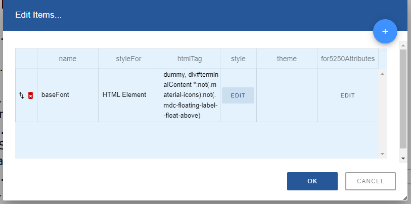
v You define a normal eXtension style (as described in the preceding section).
v You use the for5250Attributes property of the eXtension style to associate the style with one or more 5250 attribute bytes - in either an input and/or output field context.
v When a 5250 field is presented on a customized form its attribute byte is used to decide whether an eXtension style should be automatically applied.
There are some key things to know about this process:
1. The automatic application of a default style only makes sense when the 5250 field is still visualized like a 5250 field. Applying the style to a field that is visualized as something very different (eg: a drop-down, radio buttons, a push button) is not possible.
2. When a brand new element is added to a customized 5250 screen it has no 5250 attribute byte – so it is not possible to apply a style automatically. However - you can specify the style yourself, reusing one of the 5250 ones if you like.
3. You can theme these styles just like any other style. So 5250 attribute COLOR(GRN) may automatically be interpreted differently if you are using a theme of blue or olive (say).
One of the key uses of this 5250 attribute mapping feature is in the handling of DSPATR(RI) – reverse video – which is often used to indicate an error state for a 5250 field.
Note: There is no such thing as an “error state” for a 5250 field. By convention many sites use DSPATR(RI) - but some sites alter a field’s color instead.
Here is an example of using this 5250 attribute byte mapping feature to handle DSPATR(RI) for error displays:
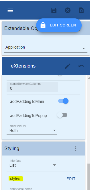
1. Open the styles property of the application:
2. Create a style called ErrorHighlighting as shown:
Name: ErrorHighlighting
Style: background-color: red
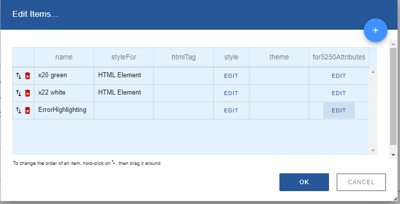
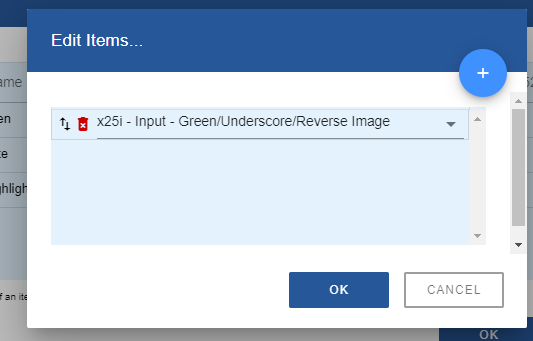
3. Click on the for5250Attributes property.
Add an item. Make it display attribute 25 - for an input field
(x25i - Input - Green/Underscore/Reverse Image)
This display attribute is commonly used by applications to indicate that a field is in error
4. Exit the style properties and save Application properties. You are now ready to test your change.
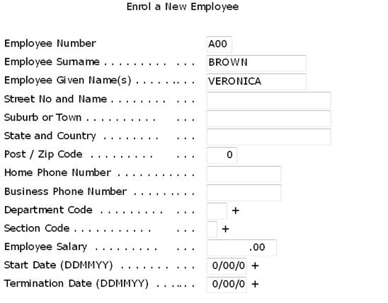
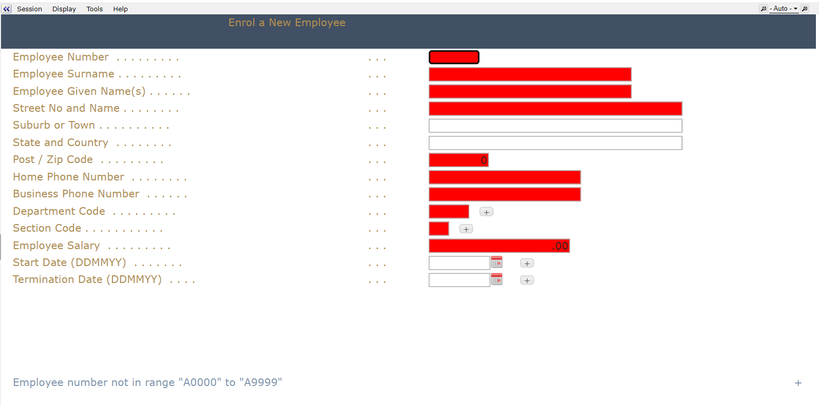
5. Run program “LIBRARY/LANSA RUN PSLSYS”.
Select Enroll a New Employee option. Blank out details and press enter, you should see the fields in error highlighted in red.
Now try editing the ErrorHighlighting style.
Change the background color to Yellow and save your changes.
Restart the 5250 application again.
The background color should have changed from Red to Yellow.