About this tutorial
|
Objectives |
This tutorial teaches you how to apply styles. |
|
Prerequisites |
Tutorial 2 - Screen and Field Identification Before attempting this tutorial, please complete all of the steps in Tutorial 2. |
|
Outline |
Default Directories Application Level Styles How to set Application Styles (Group Box header) Function Keys Basic Font Input Field Centre Screen Content Outer Div Style (Centred Content) Menus Dropdown Box Popups Text Box Subfile Header Subfile Body Datatable - Download Button Panel Datatable - Download Buttons Application Background Image/Color |
Default Directories
Note: The directories, images, and files used are based on a specific install of aXes. You will need to change these based on your own project.
Image path
/ts/skins/images
Install Path for aXesJSM
/axes421jsm/jsm/instance/www/instance/htdocs/ts
Web route directory aXesJSM
/axes421jsm/jsm/instance/www/instance/htdocs
Install Path for aXesW3(older version of aXes)
/axes421/ts
Web route directory aXesW3 (older version of aXes)
/axes421/
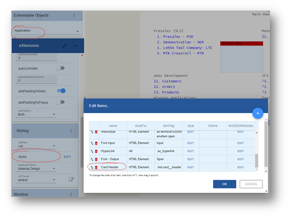
Application Level Styles
- How to set Application Styles (Group Box header)
- Define a new Application style with a meaningful name. For example, ‘Card Header’
- Set the ‘styleFor’ property to ‘HTML element’
- For the class set it to ‘.md-card__header’
- Edit the Application Styles and set the following attributes:
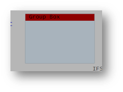
- Save your changes. The group box header will now pick up the new style.
- Function Keys
- Basic Font
- Input Field
- Centre Screen Content
- Outer Div Style (Centred Content)
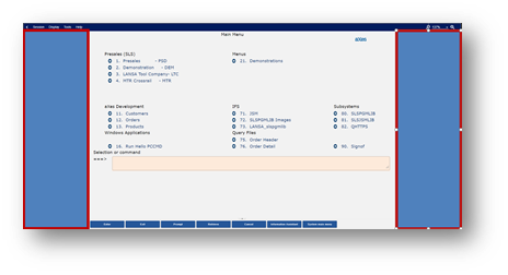
- Menus
- Dropdown Box
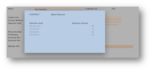
- Popups
- Text Box
- Subfile Header
- Subfile Body
- Datatable - Download Button Panel
- Datatable - Download Buttons
- Application Background Image/Color
This technique allows you to change the header style for the group box extension.
Note: There are two underscores between card and header.
Background-colour:
Height: 15px
min-Height: 15px!important
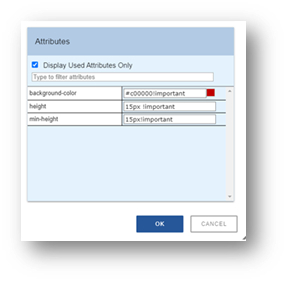
Note: In this case, ‘!important’ overrides the Material Design style, which is applied to the group box header.

Name: FButtonStyle
StyleFor: HTMLElment
htmlTag: button[id^="fkeyPanel-button"]
Style: Font-Size: larger!important
Background-Color: #oob050!important
Color: #ffff00!important
Name: Basic Font
StyleFor: HTMLElment
htmlTag: dummy, div#terminalContent *:not(.material-icons):not(.mdc- floating-label--float-above)
Style: Font-Size: 10
Font-Family: Verdana (non-proportional fonts: Lucida Console, Serif, monospace, Courier New)
Color: #c0504d

Name: InputFieldBGrnd
StyleFor: HTMLElment
htmlTag: div.mdc-text-field
Style: Background-Color: #fdeada!important
Name: CentreContent
StyleFor: HTMLElment
htmlTag: dummy, div#terminalInner
Style: Border-Left-Color: transparent
Border-Left-Style: Solid
Border-Left-Width: 1px
Border-Right-Color: transparent
Border-Right-Style: solid
Border-Right-Width: 1px
Margin-Left: auto
Margin-Right: auto
Width: 70%
Name: OuterDivBackground
StyleFor: HTMLElment
htmlTag: dummy, div#terminalOuter
Style: Background-Color: #DD9D2B
Name: Menu Style
StyleFor: HTMLElment
htmlTag: #terminalContent .ax-terminal-5250menuitem span
Style: Color: #1F497D

Name: DropdownBox
StyleFor: HTMLElment
htmlTag: Select
Style: Background-Color: #fdeada!important
Background-Image: url(/ts/skins/images/other/blue/large/down-arrow_outline.png )
Background-Origin: Padding-box
Background-Position: right center
Background-Repeat: no-repeat
Background-Size: 16px 16px
Name: PopupStyle
StyleFor: HTMLElment
htmlTag: #win1.ax-terminal-window
Style: Background-Color: #fdeada
Name: textbox
StyleFor: HTMLElment
htmlTag: div.mdc-notched-outline__idle, div.mdc-notched-outline
Style: Border-Color: white!important
Name: Subfile Header
StyleFor: HTMLElment
htmlTag: div.md-sftable-header--full
Style: Background-Color: #fdeada

Name: Subfile Body
StyleFor: HTMLElment
htmlTag: div.md-sftable--full
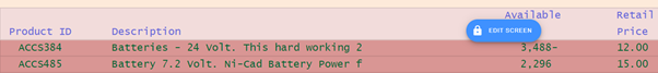
Style: Background-Color: #d99694
Name: Download Button Panel
StyleFor: HTMLElment
htmlTag: div.dt-buttons.ui-buttonset
Style: Background-Color: #d99694
Name: Download Buttons
StyleFor: HTMLElment
htmlTag: button.dt-button,div.dt-button,a.dt-button,span.ui-button-text
Style: Font-Size: smaller
Height: 30px
Padding: 0px
Name: Background Image
StyleFor: Application Window
Style: Background-Color: #oob050
Background-Image: url(/ts/ts2/css/images/
Background-Origin: padding-box
Background-Repeat: no-repeat
Background-Size: 100% 100%