Contents
The Shipped Basic jQuery Themes
Dynamically Changing jQuery Theme
Creating and Customizing jQuery Themes
jQuery Theme Extensions’ Additional Features
Using the jQuery Themes menu, you can change the default theme of the application.
The Shipped Basic jQuery Themes
aXes ships with a set of jQuery themes. These are accessible from the application’s Styling->jqueryTheme dropdown property in design mode.
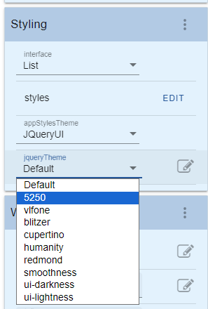
The themes above were downloaded from the jQuery Theme Roller web site (www.jqueryui.com/themeroller). You can download additional themes or customize each theme using the Theme Roller web site. These same styles will be displayed on the theme property of the jQueryTheme extension.
Initially some of this material may seem complex to you. However the time you invest in understanding it will greatly improve the final appearance of your application.
aXes Styles Hierarchy

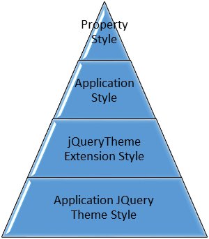
Property Style
These are the styles set using the extension’s style properties. When set, this will be applied over any other styles.
Application Style
These are the styles created using the Application’s Styling->styles property. When no specific property style is set, this will be applied over jQueryTheme Extension and Application jQuery Theme styles.
jQueryTheme Extension Style
This is the jQuery theme setting on a particular screen using the jQueryTheme extension. When the specific property styles and application style collection is not set, the jQueryTheme extension style will be applied over the Application jQuery Theme Style.
Application jQuery Theme Style
This is theme that is set using the Application->Styling->jqueryTheme dropdown property. In order for this to work, the Application->Styling->usejQueryExtensions checkbox should be checked. If no other styles are set, this will be set as the default styles for all jQuery themeable extensions. The jQuery themeable extensions are the following:
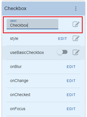
· Checkbox
— Date
— Default Visualization
— Dropdown
— Group Box
— HyperLink
— Inputbox Style 1
— Label
— Message Handler
— Mobile Camera
— Mobile Email
— Mobile SMS
— Multitype Input Box
— Push Button
— Quick Pick Menu
— Radio Button
— Screen Data Viewer
— Simple Box
— Simple Line
— Simple Stripe
— Spin Edit
— Subfile Scroller
— jQuery Keypad
This means that any existing custom styles that currently exist in a project will not be affected by choosing to use the jQuery theme. But to be able to fully experience the benefits of jQuery theme, we highly recommend removing any existing styles and work on customizing the jQuery themes.
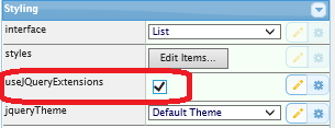
Turning jQuery Theme On
jQuery theme will be applied to existing or newly created projects by checking the Appication’s Styling->usejQueryExtensions checkbox.
When a button, radio button, checkbox and dropdown exist in a screen, the default display will be as follows:
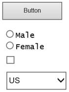
When usejQueryExtensions is checked, any extension currently added (buttons, dropdowns, etc.) which have no customized style will be set to the default jQuery theme, which is Redmond.
The appearance or style of the extensions will vary according to the currently chosen jQuery theme.
For more information of each extension’s change in appearance when using jQuery theme, please refer to the extension’s help documentation.
Changing jQuery Theme
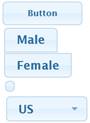
To change the default theme to another theme, just choose any shipped themes from the Application’s jqueryTheme dropdown list. For example, choosing ui-lightness from the Application’s Styling->jqueryTheme dropdown list will change the display of the extensions shown above to the following:
After changing the theme using the jqueryTheme dropdown list, just save the project and unlock the screen. The display will automatically be changed to the selected jQuery theme.
Dynamically Changing jQuery Theme
You can also dynamically change the jQuery theme by calling the SETAXESJQUERYTHEME() api. Calling GETAXESJQUERYTHEME() on the other hand will give you the current jQuery theme for the project.
In this example a quick pick menu extension has been added to the System i Main Menu like this:
Notice how the display of the quick pick menu is in accordance with the currently selected jQuery theme.
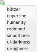
The quick pick menu's onItemSelection property has this script:
var sTheme = "";
switch (ENV.itemNumber)
{
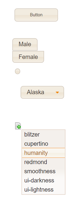
case 1: sTheme = "blitzer"; break;
case 2: sTheme = "cupertino"; break;
case 3: sTheme = "humanity"; break;
case 5: sTheme = "smoothness"; break;
case 6: sTheme = "ui-darkness"; break;
case 7: sTheme = "ui-lightness"; break;
default: sTheme = "redmond"; break;
}
SETAXESJQUERYTHEME(sTheme);
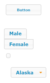
Using the above script, when “humanity” is selected from the quick pick menu, the screen extensions’ display will be changed to the following:
SETAXESJQUERYTHEME can be called on any property that allows scripting as an input.
Note: Calling SETAXESJQUERYTHEME will change the default jQuery theme for the application. This means that any screens that do not define its own jQuery theme using the jQuery Theme extension will be displayed using the jQuery theme that was set using SETAXESJQUERYTHEME.
Creating and Customizing jQuery Themes
jQuery themes can be created or customized (change styles, rename, etc.) to suit your taste using the jQuery ThemeRoller web site at http://jqueryui.com/themeroller/. After customization, you can download and use the theme in your existing projects or on newly created ones. Below is the steps on how you can customize the jQuery theme to make the jQuery extensions appear as you want it to.
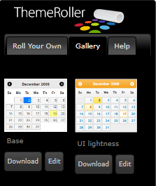
The ThemeRoller Interface
· Roll Your Own Tab
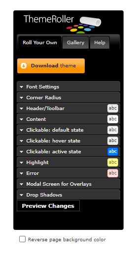
This tab is where you can create or customize the styles of your jQuery theme.
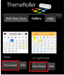
· Gallery Tab
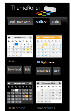
The Gallery tab is where existing jQuery themes can be selected, downloaded and previewed. You can choose a theme by clicking at it and the preview will automatically be seen on the Preview portion of the page.
· Preview
On the right hand side of the page is where you can see the preview of the jQuery theme. When changing the values of certain styles using the Roll Your Tab, the preview part will automatically be updated to show your changes. In the Gallery Tab, when clicking on an existing theme, it will automatically be shown on the preview pane.
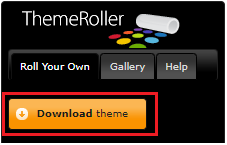
· Download Button
Download buttons exist both in the Roll Your Own tab and the Gallery Tab. Click the download button on the Gallery tab will take you to the download page where you can download the existing jQuery theme that you selected. Clicking the download button on the Roll Your Own tab will take you to the same download page but it will download the current settings or customization you have on the Roll Your Own tab.
Creating your own theme
To start creating your own theme, just go to the ThemeRoller page and change the settings on the Roll Your Own tab. The following are the styles that can be changed:
· Font Settings
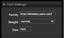
Changing the font settings will affect the default font settings that is being used on all jQuery extensions. If no font settings is set for the application, this font setting will be used to display the text on the terminal screen.
Try to change the Font Size to 2.1em and see how most of the texts on the preview screen becomes large.
· Corner Radius
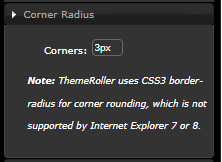
The corner radius is used for the rounding of the corners of the jQuery extensions. The lower the value, the smaller the rounding appears. As written in the “Note”, this setting is not supported on IE7 or IE8. Try changing the value to 1px and see on the preview how the round shape of the corners of the buttons, tabs, windows, etc. decrease.
· Header/Toolbar
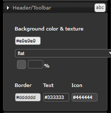
The Header/Toolbar setting is used in the jQuery Groupbox and Date extension. Changing these styles will impact the font, border, background and icons of the headers of the Group Box and the Date extension.
· Content
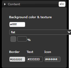
Changing the Content styles will change the background, border and text colour of the input boxes in the terminal screen. This includes the Inputbox, Multitype Input Box, jQuery Keypad, etc.
· Clickable: default state
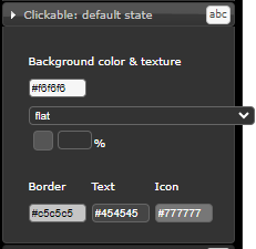
These styles when changed will affect the text colour, background, icon and border of extensions that can be clicked such as Push Buttons, Mobile SMS, Date, etc. The default state indicates that this is the style of these clickable extensions when being displayed without any user interaction
· Clickable: hover state
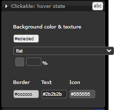
These styles are applied to clickable extensions when the mouse is hovered over it. The style will revert back to the Clickable: default state once the mouse leaves the extension.
· Clickable: active state
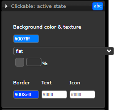
The active state style will be applied when the clickable extensions are click or pushed. If the extension is a button, after pushing, the style will revert back to the default state. For other extensions that retains the push state, such as checkbox, radio buttons, etc., this style will remain unless the extension is clicked again. Clicking again will toggle the state back to the default state therefore applying the default state style.
· Highlight
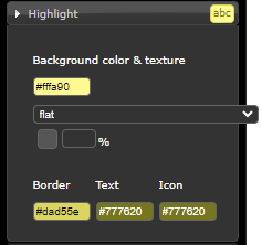
This style is not currently being implemented in existing jQuery extensions. But it will be applied in future extensions where any message or information is displayed on the screen. This may include hints, placeholder, etc.
· Error
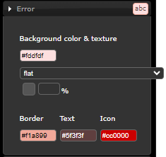
This style is also not yet being used in any extensions but can be used in future extensions where error messages needs to be displayed.
· Modal Screen for Overlays
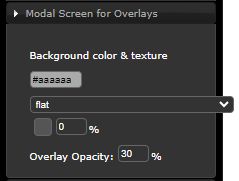
This style is not yet being used but will be implemented on the background screen of a popup window.
· Drop Shadows
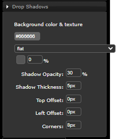
This style is not yet being used but will be implemented as a style for the popup window.
For more details on the specific description of each styles property and classes that uses these styles, please visit the jQuery CSS Framework site referenced on the bottom of this tutorial.
Customizing a jQuery Theme
In order to customize existing jQuery Themes, you first need to select an existing theme from the Gallery tab of ThemeRoller and then clicking on the Edit button underneath the theme.
Clicking on the Edit button will bring you back to the Roll Your Own tab with the selected theme’s style set and the preview displayed.
From there you can customize the styles and download the theme.
Deleting jQuery Themes
To delete a jQuery Theme, just delete its folder from the \ts\ts2\css\projectThemes folder. Deleting the folder of the theme will delete it from the jqueryTheme dropdown list.
jQuery Theme Styles and Extension Table
The table below lists the jQuery Theme Styles and the extensions that will be affected when they are changed.
· Auto Complete
N.A.
· Checkbox
|
Font |
Corner |
Header |
Content |
Default |
Hover |
Active |
Highlight |
Error |
Overlays |
Shadows |
|
Yes |
Yes |
No |
No |
Yes |
Yes |
Yes |
No |
No |
No |
No |
· Date
|
Font |
Corner |
Header |
Content |
Default |
Hover |
Active |
Highlight |
Error |
Overlays |
Shadows |
|
Yes |
No |
Yes |
Yes |
Yes |
Yes |
Yes |
No |
No |
No |
No |
· Default Visualization
|
Font |
Corner |
Header |
Content |
Default |
Hover |
Active |
Highlight |
Error |
Overlays |
Shadows |
|
Yes |
No |
No |
Yes |
No |
No |
No |
No |
No |
No |
No |
· Dropdown
|
Font |
Corner |
Header |
Content |
Default |
Hover |
Active |
Highlight |
Error |
Overlays |
Shadows |
|
Yes |
Yes |
No |
Yes |
Yes |
Yes |
No |
No |
No |
No |
No |
· Frame
N.A.
· Function Key Panel
N.A.
· Google Chart
N.A.
· Group Box
|
Font |
Corner |
Header |
Content |
Default |
Hover |
Active |
Highlight |
Error |
Overlays |
Shadows |
|
Yes |
No |
Yes |
Yes |
No |
No |
No |
No |
No |
No |
No |
· Hyperlink
|
Font |
Corner |
Header |
Content |
Default |
Hover |
Active |
Highlight |
Error |
Overlays |
Shadows |
|
Yes |
No |
No |
No |
No |
No |
No |
No |
No |
No |
No |
· Image
N.A.
· Inputbox Style 1
|
Font |
Corner |
Header |
Content |
Default |
Hover |
Active |
Highlight |
Error |
Overlays |
Shadows |
|
Yes |
No |
No |
Yes |
No |
No |
No |
No |
No |
No |
No |
· Label
|
Font |
Corner |
Header |
Content |
Default |
Hover |
Active |
Highlight |
Error |
Overlays |
Shadows |
|
Yes |
No |
No |
No |
No |
No |
No |
No |
No |
No |
No |
· Message Handler
|
Font |
Corner |
Header |
Content |
Default |
Hover |
Active |
Highlight |
Error |
Overlays |
Shadows |
|
Yes |
Yes |
No |
Yes |
Yes |
Yes |
Yes |
No |
No |
No |
No |
· Mobile Camera
|
Font |
Corner |
Header |
Content |
Default |
Hover |
Active |
Highlight |
Error |
Overlays |
Shadows |
|
Yes |
No |
No |
No |
No |
Yes |
Yes |
No |
No |
No |
No |
· Mobile Email
|
Font |
Corner |
Header |
Content |
Default |
Hover |
Active |
Highlight |
Error |
Overlays |
Shadows |
|
Yes |
Yes |
No |
No |
Yes |
Yes |
Yes |
No |
No |
No |
No |
· Mobile SMS
|
Font |
Corner |
Header |
Content |
Default |
Hover |
Active |
Highlight |
Error |
Overlays |
Shadows |
|
Yes |
Yes |
No |
No |
Yes |
Yes |
Yes |
No |
No |
No |
No |
· Multitype Input Box
|
Font |
Corner |
Header |
Content |
Default |
Hover |
Active |
Highlight |
Error |
Overlays |
Shadows |
|
Yes |
No |
No |
Yes |
No |
No |
No |
No |
No |
No |
No |
· Push Button
|
Font |
Corner |
Header |
Content |
Default |
Hover |
Active |
Highlight |
Error |
Overlays |
Shadows |
|
Yes |
Yes |
No |
No |
Yes |
Yes |
Yes |
No |
No |
No |
No |
· Quick Pick Menu
|
Font |
Corner |
Header |
Content |
Default |
Hover |
Active |
Highlight |
Error |
Overlays |
Shadows |
|
Yes |
No |
No |
Yes |
No |
Yes |
No |
No |
No |
No |
No |
· Radio Button
|
Font |
Corner |
Header |
Content |
Default |
Hover |
Active |
Highlight |
Error |
Overlays |
Shadows |
|
Yes |
Yes |
No |
No |
Yes |
Yes |
Yes |
No |
No |
No |
No |
· Raw HTML
N.A.
· Screen Data Viewer
|
Font |
Corner |
Header |
Content |
Default |
Hover |
Active |
Highlight |
Error |
Overlays |
Shadows |
|
Yes |
No |
No |
No |
No |
No |
No |
No |
No |
No |
No |
· Simple Box
|
Font |
Corner |
Header |
Content |
Default |
Hover |
Active |
Highlight |
Error |
Overlays |
Shadows |
|
Yes |
Yes |
No |
Yes |
No |
No |
No |
No |
No |
No |
No |
· Simple Line
|
Font |
Corner |
Header |
Content |
Default |
Hover |
Active |
Highlight |
Error |
Overlays |
Shadows |
|
Yes |
No |
No |
Yes |
No |
No |
No |
No |
No |
No |
No |
· Simple Stripe
|
Font |
Corner |
Header |
Content |
Default |
Hover |
Active |
Highlight |
Error |
Overlays |
Shadows |
|
Yes |
Yes |
Yes |
No |
Yes |
Yes |
No |
No |
No |
No |
No |
· Spin Edit
|
Font |
Corner |
Header |
Content |
Default |
Hover |
Active |
Highlight |
Error |
Overlays |
Shadows |
|
Yes |
No |
No |
Yes |
No |
No |
No |
No |
No |
No |
No |
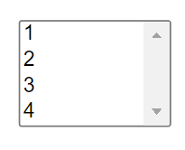
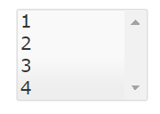
· Subfile Scroller
|
Font |
Corner |
Header |
Content |
Default |
Hover |
Active |
Highlight |
Error |
Overlays |
Shadows |
|
No |
Yes |
No |
No |
Yes |
Yes |
Yes |
No |
No |
No |
No |
· Theme (jQuery)
N.A.
· Timer
N.A.
· jQuery Keypad
|
Font |
Corner |
Header |
Content |
Default |
Hover |
Active |
Highlight |
Error |
Overlays |
Shadows |
|
Yes |
Yes |
No |
No |
Yes |
No |
Yes |
No |
No |
No |
No |
Refer to the table of each extensions if you intend on customizing using the ThemeRoller so you can know which of the extensions will be affected by any changes you make on the style.
Downloading jQuery Themes
To download existing jQuery themes or customize existing themes to create your own theme, you can go the jQuery ThemeRoller web site at http://jqueryui.com/themeroller/.
To download customized theme, click on the Download theme button located on the Roll Your Own tab.
To download existing jQuery themes, click on the Download button located at the bottom of the theme you wish to download on the Gallery tab.
Clicking any of the download buttons mentioned above will bring you to the Theme Roller download page.
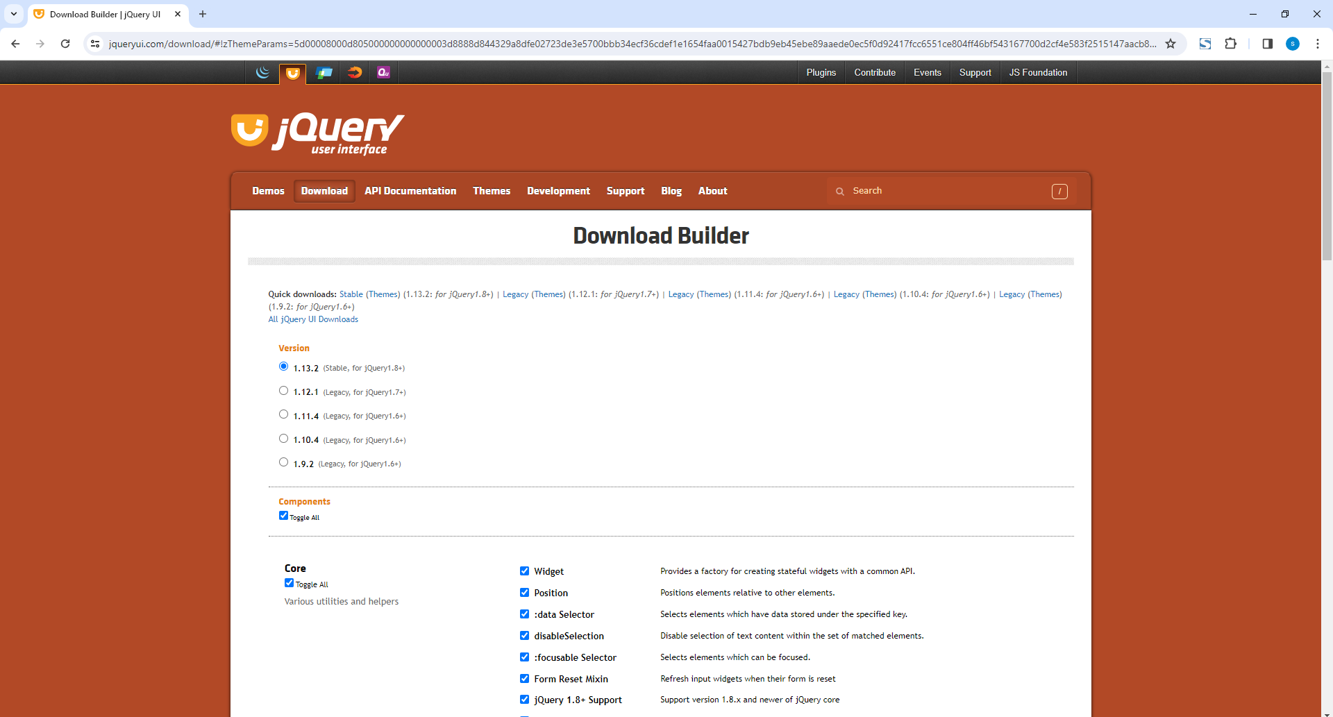
Just leave most of the settings unchanged and go to the bottom of the page.
Input “.terminalTheme” (with the dot) in the CSS Scope input box.
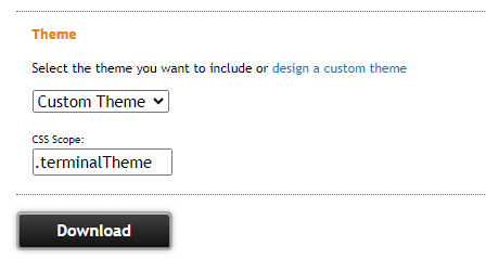
Click on the download button and save the files in your local folder.
Then extract the file (jquery-ui-1.11.4.custom.zip).
Rename the extracted folder to “jQtheme_” + <theme name> where <theme name> is the name of theme that you want to appear in the jqueryTheme dropdown list. The <theme name> is the name that will also be used to passed as an argument to the SETAXESJQUERYTHEME() api. So choose your name wisely.
After renaming, copy the whole directory (jQtheme_<theme name>) into your project’s theme folder located at \ts\screens\<project name>\projectThemes where <project name> is the name of your project where you wish to use the downloaded theme.
Note: Make sure to set the authorities of all the file inside the jQtheme_<theme name> ti *PUBLIC *R authorities. Use the WRKLNK command in your IBM i to ensure that the new files only have the *PUBLIC *R authorities.
If you want the theme to be selectable on newly created projects, just copy the theme folder into the \ts\ts2\css\projectThemes folder. Copying the theme into this folder will not make it selectable on existing projects. You need to copy the theme into the existing projects that you want it to be used.
jQuery Theme Extensions’ Additional Features
The following are the behaviours and features that will be added into the extensions when usejQueryExtensions is checked.
· Hover
Some clickable extensions will change display when the mouse is hovered over it. The hover style can be customized using the Clickable: hover state styles in ThemeRoller. Some notable components are Push Button, Checkbox and Radio Button.
· Labels
Labels can already be set as a property for the Dropdown and Checkbox extensions. For the checkbox, the button of the checkbox will be proportional to the width of the label.
· Display
Besides being better looking and themeable compared to the basic extensions, using the jQuery Theme Extensions will fix some of the display issues that cannot be fixed in the basic extensions. An example is the problem with dropdown menu being displayed in the wrong position when the screen is zoomed. This will be handled better using the jQuery extensions.
The detailed comparison between the basic extension and the jQuery extension will be explained below.
Difference between Basic and jQuery Extensions
Aside from being themeable, some of the noticeable difference between the basic and jQuery extensions are described below.
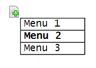
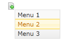
· Checkbox
With the jQuery Checkbox extension, the label can be set using the label property of the extension. Setting the value of the label will automatically resize the button width so that the label will fit into the checkbox.
Label Property:
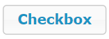
Basic Checkbox:

jQuery Checkbox:
|
Without label |
With Label |
|
|
|

jQuery Checkbox in checked mode:
|
Without label |
With Label |
|
|
|


Note: There is a possibility that the label set in the checkbox will be lost when you set the usejQueryExtensions from checked to unchecked and then to checked again.
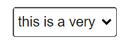
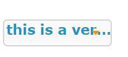
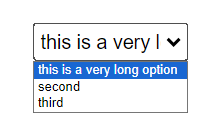
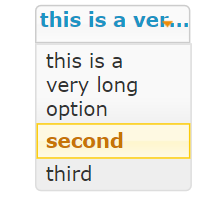
· Dropdown
With jQuery Dropdown extension, long text options are truncated with “…” to indicate that the full text is not displayed. Also, the Dropdown menu’s width is the same as the extension’s width unlike the basic extension. Long text that won’t fit the width are automatically moved to the next line for the jQuery extension.
|
Basic extension with a long text as option: |
jQuery extension with a long text as option:
|
|
|
|
|
Basic Extension Dropdown menu |
jQuery Extension Dropdown menu |
|
|
|
· Group Box
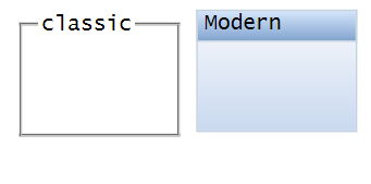
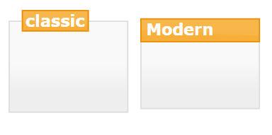
The only difference with the Basic and jQuery Group Box is that the jQuery Group Box extension will be displayed based on the jQuery theme set for the screen. When no theme is set but the usejQueryExtensions property is checked, the default Redmond theme will be used for the display.
Basic extension with Classic and Modern look:
jQuery Extension with Classic and Modern look (with default Redmond theme):
· Quick Pick Menu
There is no difference in the icon of the Quick Pick Menu but the display of the menu will be themed according to the currently set jQuery theme.
|
Basic Extension |
jQuery Extension |
|
|
|
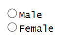
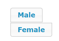
· Radio Button
The jQuery Radio Button extension’s appearance and behaviour will be like the jQuery checkbox extension. The difference between the selected and unselected display can be seen below.
|
Basic extension |
jQuery Extension |
|
|
|
· Simple Stripe
The Simple Stripe jQuery extension will not have the gradient style that is being used by the basic Simple Stripe extension. Instead of using gradients, the Simple Stripe jQuery extension uses the jQuery theme’s background styles which uses image in the background. Also, the Simple Stripe jQuery extension will not use the orientation property. The useOldStyle property is added to allow the use of the basic Simple Stripe behaviour. Checking the useOldStyle property will ignore the current jQuery theme and use the style settings in the USERENV object instead. This will result in the extension being displayed the same as the basic Simple Stripe extension.
|
Basic Extension |
jQuery Extension |
|
orientation = horizontal
|
orientation = horizontal
|
|
orientation = vertical |
orientation = vertical |


· Spin Edit
Besides the difference in appearance, the jQuery Spin Edit extension’s behaviour changed to properly support the visibleLines property. On the basic extension, setting this value to greater than 1 will have no effect on the height of the extension. The basic extension’s height will always be the same as the height of the field. For the jQuery extension, setting the visibleLines to more than 1 will automatically resize the height of the extension to be able to display the number of items indicated in the visibleLines property. To support the basic extension’s behaviour of the height being always the same as the field, all you have to do is to set the visibleLines property of the jQuery Spin Edit extension to zero.
When setting the visibleLines property to 4, the display will be as follows:
|
Basic Extension |
jQuery extension |
|
|
4 items will be viewable |
· Theme (jQuery)
On the Basic Theme (jQuery) extension, putting it in a screen not only changes the theme of the screen but of the development environment as well. Also, when changing to a different screen (without the Theme (jQuery) extension in it), the screen will also inherit the theme that was set on the previous screen. This does not allow each screen to have its own jQuery theme setting. For the new version of Theme (jQuery) extension, it will only be applied to the screen where it was added. Moving to a different screen will not inherit the theme of the previous screen but it will apply the theme setting of the application.
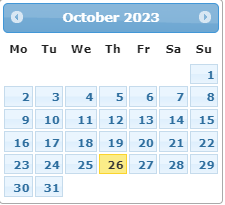
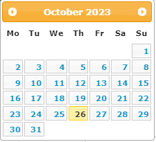
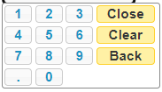
· jQuery Keypad and Date
Although jQuery Keypad and Date extension are already jQuery extensions, the basic extensions cannot have its default theme to be changed unless a Theme (jQuery) extension is added with it in a screen. But with the jQuery extension version, the jQuery Keypad and Date extension will be displayed according to the set theme for the screen.
jQuery Keypad and Date with different themes:
Redmond Theme
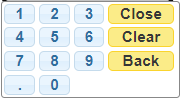
ui-lightness Theme
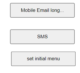
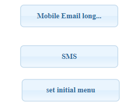
· Push Button, Mobile Email, Mobile SMS, Subfile Scroller
All button extensions will have a new look along with the hover feature.
|
Basic extension |
jQuery extension |
|
|
|
· Default Visualization, Inputbox Style 1, Multitype Input Box
All input type extensions will have its border and background colour customizable.
· Label, Hyperlink, Mobile Camera, Screen Data Viewer, etc.
All other extensions just use the jQuery theme font setting when the usejQueryExtensions property is checked.
Limitations
When converting existing projects to use jQuery extensions, layout problems may arise related to the font size and other styles. In case such problem occurs, you can always customize the jQuery Theme to use the style that are being used by the existing project.
Some extensions’ text alignment are highly dependent on the jQuery widget, such as the dropdown, buttons, checkbox and radio buttons, that setting its height to a smaller value than the font size will cause alignment problems.
An example of display issues that may occur is as follows:
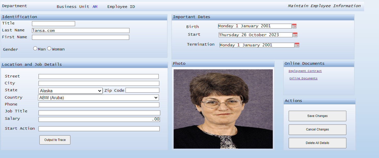
The Edit Employee Information screen customized without using jQuery Extensions
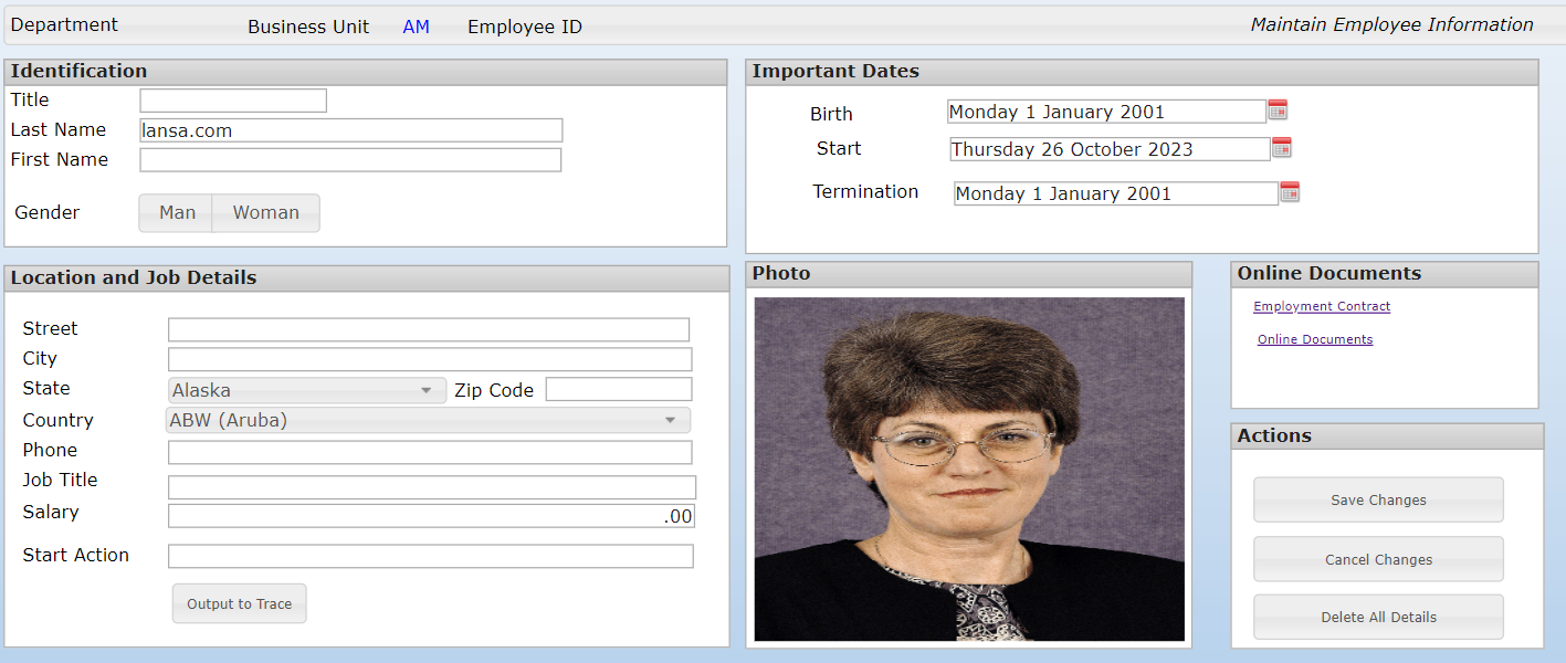
The same screen using the jQuery Extension
Since the base font for the two screens are different, the display issues indicated above will occur. Therefore, resizing and realigning the extensions on the screen will be needed.
 jQuery Theme is based on the jQuery framework.
The functionality and customization is limited to the capability and
limitations of the jQuery framework. Any jQuery framework related issues will
need to be handled once they are identified.
jQuery Theme is based on the jQuery framework.
The functionality and customization is limited to the capability and
limitations of the jQuery framework. Any jQuery framework related issues will
need to be handled once they are identified.
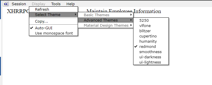
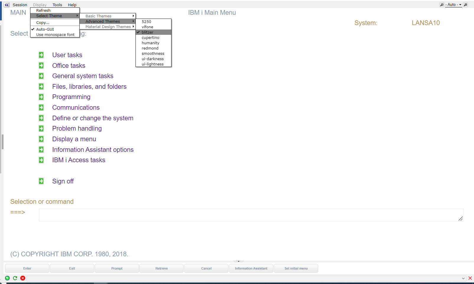
jQuery Themes aXes Menu
When the Appication’s Styling->usejQueryExtensions checkbox is checked and the jqueryTheme property is set to “Default”, the jQuery Themes menu will be enabled. The menu is located in the aXes Display->Select Theme->jQuery Themes menu. All jQuery themes shipped with aXes will be listed in this menu.
When jQuery theme is enabled, after the user login then the themes can be selected.
Changing the theme is still possible using the menu which will result in the following screen when the theme is set to “blitzer” using the jQuery Themes menu.
When a Theme(jQuery) extension exist in a screen, changing the jQuery theme using the jQuery Themes menu will have no effect because the extension’s theme setting will have a higher priority. Therefore, the screen will always be displayed using the extension’s theme even if different themes are selected using the jQuery Themes menu.
See Also
Using jQuery UI ThemeRoller: http://learn.jquery.com/jquery-ui/themeroller/
CSS Framework: http://api.jqueryui.com/theming/css-framework/
A Massive Guide to Custom Theming jQuery UI Widdgets: http://code.tutsplus.com/tutorials/a-massive-guide-to-custom-theming-jquery-ui-widgets--net-22714