axSwitch
Description
axSwitch allows a switch to be inserted into the 5250 screen. Switches communicate an action a user can take. They are typically placed throughout your UI, in places like dialogs, forms, cards, and toolbars.
Usability
|
Context |
Supported |
|---|---|
|
Input screen fields |
No |
|
Output screen fields |
Yes |
|
Input subfile fields |
No |
|
Output subfile fields |
No |
|
New screen elements |
Yes |
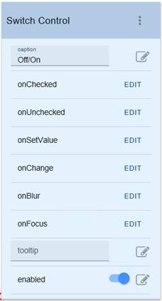
Properties
|
Name |
Description and Comments |
JavaScript |
Shipped default |
|---|---|---|---|
|
caption |
Specifies the text that is to appear on the switch. |
Yes. Must return a string. |
Off/On. |
|
enabled |
Yes. Must return a Boolean |
Yes |
True. |
|
onBlur |
Optional. JavaScript code to be executed when the element lost the focus. |
Yes |
None |
|
onChange |
Optional. JavaScript code to be executed when the element changes state from unchecked to checked and vice versa. |
Yes |
None |
|
onChecked |
Sets the field to the nominated value when the switch is on. |
Yes |
FIELD.setValue("On") |
|
onFocus |
Optional. JavaScript code to be executed when the element receives the focus |
Yes |
None |
|
onSetValue |
Returns true if the field contains the value set when the switch is on. |
Yes |
FIELD.getValue() == "On" |
|
onUnChecked |
Sets the field to the nominated value when the switch is off |
Yes |
FIELD.setValue("Off") |
|
sizeToField |
Indicates whether this button should be sized to fill its containing field or automatically sized to match its content. |
Yes |
TRUE |
|
tooltip |
IThe tool tip (or hint) that should appear when the user hovers the mouse over this button. |
Yes. Must return a string. |
None |
Warnings
his extension is available only in material design theme. This extension is almost similar in functionality and usage to checkbox extension. See axCheckbox extension for more example usage and replace checkbox with axSwitch.
Examples
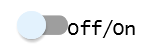
Example 1:
Add a switch extension to the screen on design mode.
Extension Property:
Rendered on Screen:
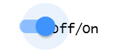
when toggled on
See Also
Application Style Collection for Application themes