axRadioButton
Description
axRadioButton allows the creation of a set of radio buttons.
Usability
|
Context |
Supported |
|---|---|
|
Input screen fields |
Yes |
|
Output screen fields |
Yes |
|
Input subfile fields |
No |
|
Output subfile fields |
No |
|
New screen elements |
Yes |
Properties
|
Name |
Description and Comments |
JavaScript |
Shipped default |
|---|---|---|---|
|
captionStyle |
CSS to apply to the text of the radio buttons. For Basic and JQueryUI theme only. |
No |
None |
|
dataSourceType |
Indicate where the source data is obtained from. |
No |
fixedValues |
|
enabled |
Indicates whether this element is enabled. TS2 only. |
Yes. Must return a Boolean. |
True |
|
fitText |
Indicates whether to automatically resize the text to fit inside the extension. For JQueryUI theme only. |
Yes. |
True |
|
fixedValues |
For Fixed values data source type you must enter the value pairs used to fill the radio button |
Yes. Must return an array of value pair object. |
No |
|
keepLastKey |
For Dynamic Table data source. If this option is true, a dynamic table will only be reloaded if the key changes. |
No |
False |
|
onBlur |
Optional. JavaScript code to be executed when the element lost the focus. |
Yes. |
None |
|
onChange |
Optional. JavaScript code to be executed when the element changes state from unchecked to checked and vice versa. |
Yes. |
None |
|
onCreateRadioButton |
JavaScript code to execute to set the radio button text. |
Yes |
ROW.text |
|
onFocus |
Optional. JavaScript code to be executed when the element receives the focus. |
Yes. |
None |
|
onRadioButtonClicked |
Event fired when clicking on a Radio Button |
Yes |
FIELD.setValue(ROW.value) |
|
onSelectRadio |
Determines the radio button entry to select. |
Yes |
ROW.value |
|
orientation |
Layout the radio buttons horizontally (orientation = H) or vertically (orientation = V) |
No |
V (vertical) |
|
radioButtonStyle |
CSS to apply to the radio buttons. For Basic and JQueryUI theme only. |
No |
None |
|
sqlQueryName |
For Dynamic Table data source type the value set for the name = property |
No |
None |
|
sqlVariables |
For Dynamic Table data source the variables used in your query. |
|
ENV.SQL.SQLVariableLibrary = USERENV.dftSQLDataLibrary |
|
tableName |
For Static Table data source type, this must be the value set for the name = property. For Dynamic Table, XML File or Fixed values this property is ignored and sqlQueryName is used instead. |
No |
None |
|
xmlFileName |
Name of XML file when the source type is XML. |
No |
None |
|
xmlFileLocation |
Path to locate the xmlFileName when the source type is XML. |
No |
*DEFAULT which is equal to /ts/screens/<private folder> |
Notes, Comments and Warnings
The dataSourceType property determines the method used to populate the radio button.
Except for Dynamic Table you should specify a tableName.
Fixed Values: use this setting to hard code the value and text of the radio buttons.
Static Table: static tables are loaded once from the server at start up. The name of the static table must be the name specified in tableName.
XML File: the data to fill the table is obtained from an XML file located by default in /ts/screens/<private folder>. To specify another location change the xmlFileLocation property.
Dynamic Table: use this option carefully as it is the only one where the data is loaded at every screen arrival with an expected performance impact in the rendering of the screen. When you use this option you must specify the name of the query in sqlQueryName as defined in your dynamic tables file. You can use the keepLastKey option to improve performance, if multiple requests using the same query key are commonly made.
What is a ROW?
The radio button makes use of the aXes table structures. It means that the data to create the radio button is stored in memory in a table-like structure consisting of rows and columns. For example, consider a table defined like this:
DefineObjectInstance { className = "StaticTable",
name = "Gender",
source = "inline",
rows = {
{value="M",text="Male"},
{value="F",text="Female"},
},
};
(Note that for such a table you would most likely set the dataSourceType to Fixed Values and type in the values manually).
At start up aXes populates the tables with one called Gender. It will have 2 rows, each ROW consisting of columns value and text. Using the Gender table, ROW.value would yield the current row's value= value and ROW.text the current row's text= value.
There is no constraint on how you name the row columns. If you use other names you must remember to change the default values to reflect the column names.
For example, if your file or fixed values define your columns like this:
rows = {
{codigo="M",descripcion="Masculino"},
{codigo="F",descripcion="Femenino"},
},
};
The default values or script code should refer to ROW.codigo and ROW.descripcion.
onCreateRadioButton event:
This event creates the radio button and sets its displayable text. It will fire (following our table example) whenever a screen (any screen) that has a radio button whose tableName was set to Gender arrives.
It will locate the Gender table and iterate through all its entries.
For each entry it will create a radio button using the value of the text column of the Gender table as the label. The result in our example will be two radio buttons: one with caption Male and the other with caption Female.
This is the simplest way to use onCreateRadioButton.
A more powerful way would be to create the radio buttons with a value resulting from the evaluation of a more complex expression.
If we extended the Gender table like this:
DefineObjectInstance { className = "StaticTable",
name = "Gender",
source = "inline",
rows = {
{value="M1",text="Male", agerange="16-25"},
{value="M2",text="Male", agerange="26-35"},
{value="M3",text="Male", agerange="36-45"},
{value="F1",text="Female", agerange="16-25"},
{value="F2",text="Female", agerange="26-35"},
{value="F3",text="Female", agerange="36-45"},
},
};
We could change onCreateRadioButton to say:
ROW.text + "s aged " + ROW.agerange
which would create this set of radio buttons:
Males aged 16-25
Males aged 26-35
Males aged 36-45
Females aged 16-25
Females aged 26-35
Females aged 36-45
onSelectRadio event:
The code in this event determines which radio button to set as the selected (checked). It can be something simple like the default value:
ROW.value
If the expression does not return a value of type Boolean, the default logic of
comparing the value is returned with the associated field's value.
An example of an expression returning a value of type Boolean would be:
(ROW.value == "Hello")
onRadioButtonClicked event:
This event fires when a radio button is clicked. The default behaviour here is
FIELD.setValue(ROW.value)
In other words, set the value of the field (which is referred to as FIELD) associated with the radio button to the value of the selected ROW.
In Application, appStylesTheme = JQueryUI
When JQueryUI is selected from Application->Styling->appStylesTheme property, the display of this extension will change according to the theme that was set in the Application’s jqueryTheme property.
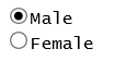
Basic display:
When JQueryUI theme is selected:
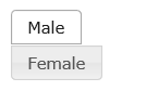
As you can see above, the Radio Button options are displayed as buttons. Clicking/Selecting one option will change its display indicating that it is the selected item as shown by the Male option. The size of the button will automatically adjust to the size of the option string. The longer the option string, the wider the button becomes.
In Application, appStylesTheme = Material Design
When Material Design is selected from Application->Styling->appStylesTheme property, the display of this extension will change according to the theme that was set in the Application’s mdTheme property.
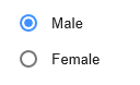
When Material Design theme is selected:
fixedValues:
Sets the data of Radio Button when Fixed Values is selected as the dataSourceType. If using script, the ENV.returnValue must contain an array of value pair object as follows:
ENV.returnValue = [ { value: "M", text: "Male" },
{ value: "F", text: "Female" }
];
See Also
Radio Buttons in Tutorial 6 - Advanced Screen Enhancement
Application Style Collection for Application themes