axMultitypeInputbox
Description
Allow a user add an HTML input element which can be text, color, email, file, number, password or url.
Also included in this eXtension is the Japanese Kana conversion function with the Furigana input type.
Usability
|
Context |
Supported |
|---|---|
|
Input screen fields |
Yes |
|
Output screen fields |
Yes |
|
Input subfile fields |
Yes |
|
Output subfile fields |
Yes |
|
New screen elements |
Yes |
Properties
eXtension properties vary depending on the selected input type.
Properties when Text (default) is selected as inputType:
|
Name |
Description and Comments |
JavaScript |
Shipped default |
|---|---|---|---|
|
enabled |
Indicates whether this element is enabled. TS2 only. |
Yes. Must return a Boolean. |
True |
|
helpertext |
The helper text provides supplemental information to users. For Material Design theme only. |
Yes. Must return a String. |
None |
|
helpertextStyle |
CSS properties to be applied to helpertext or validation message of this eXtension. For Material Design theme only. |
Yes. Must return a valid style object. |
None |
|
icon |
The name of icon to display. For Material Design theme only. |
Yes. Must return a String. |
None |
|
iconPosition |
Specify whether to display the icon as leading or trailing. The values are Left Position and Right Position. For Material Design theme only. |
No |
Left Position |
|
iconStyle |
CSS properties to be applied to icon. For Material Design theme only. |
Yes. Must return a valid style object. |
None |
|
inputType |
List of input elements that can be selected. Current values are Color, Email, File, Furigana, Number, Password and URL. Text is the default value when none is selected. |
No |
None |
|
labelStyle |
CSS properties to be applied to label (placeholderText). For Material Design theme only. |
Yes. Must return a valid style object. |
None |
|
onBlur |
Optional. JavaScript code to be executed when the element loses the focus. |
Yes |
None |
|
onChange |
Optional. JavaScript code to be executed when the value changes. |
Yes |
None |
|
onFocus |
Optional. JavaScript code to be executed when the element receives the focus. |
Yes |
None |
|
onPrompterClick |
Javascript code to be executed when the user clicks on the prompter button. |
Yes |
SENDKEY('F4'); |
|
onScreenReady |
Optional. JavaScript code to be executed every time layout render of all extension is completed. |
Yes |
None |
|
pattern |
The regular expression to check against the value of this extension. |
Yes. Must return a String. |
Blank |
|
placeholderText |
The text to be displayed as a short hint for this extension. In Material Design theme, it also acts as the label. |
Yes. Must return a String.
|
None |
|
prompter |
Indicates whether to add a prompter to this extension. |
Yes. Must return a Boolean. |
False |
|
required |
Indicates whether this extension must be filled up. |
Yes. Must return a Boolean. |
False |
|
style |
CSS properties to be applied to the eXtension. |
Yes. Must return a valid style object. |
None |
|
textFieldStyle |
Specify the appearance of the multitype input box extension as a TextField object. The values are Standard and Outlined. For Material Design theme only. |
No |
Standard |
|
value |
Indicates the initial value of the input element. |
Yes. Must return a String. |
None |
|
validationMessage |
The message to replace the default validation message. |
Yes. Must return a String. |
None |
Properties when Color is selected as inputType:
|
Name |
Description and Comments |
JavaScript |
Shipped default |
|---|---|---|---|
|
enabled |
Indicates whether this element is enabled. TS2 only. |
Yes. Must return a Boolean. |
True. |
|
inputType |
List of input elements that can be selected. Current values are Color, Email, File, Furigana, Number, Password and URL. Text is the default value when none is selected. |
No |
Color |
|
onBlur |
Optional. JavaScript code to be executed when the element loses the focus. |
Yes |
None |
|
onChange |
Optional. JavaScript code to be executed when the value changes. |
Yes |
None |
|
onFocus |
Optional. JavaScript code to be executed when the element receives the focus. |
Yes |
None |
|
onScreenReady |
Optional. JavaScript code to be executed every time layout render of all extension is completed. |
Yes |
None |
|
style |
CSS properties to be applied to the eXtension. |
Yes. Must return a valid style object |
None |
|
textFieldStyle |
Specify the appearance of the multitype input box extension as a TextField object. The values are Standard and Outlined. For Material Design theme only. |
No |
Standard |
|
value |
Indicates the initial value of the input element. The value must be a hexadecimal color code, usually starts with “#”. (e.g. #BFAA8F). When invalid color code is set, the browser will display black as the default color. |
Yes. Must return a String. |
#000000 |
Properties when Email is selected as inputType:
|
Name |
Description and Comments |
JavaScript |
Shipped default |
|---|---|---|---|
|
enabled |
Indicates whether this element is enabled. TS2 only. |
Yes. Must return a Boolean. |
True. |
|
helpertext |
The helper text provides supplemental information to users. For Material Design theme only. |
Yes. Must return a String. |
None |
|
helpertextStyle |
CSS properties to be applied to helpertext or validation message of this eXtension. For Material Design theme only. |
Yes. Must return a valid style object. |
None |
|
icon |
The name of icon to display. For Material Design theme only. |
Yes. Must return a String. |
None |
|
iconPosition |
Specify whether to display the icon as leading or trailing. The values are Left Position and Right Position. For Material Design theme only. |
No |
Left Position |
|
iconStyle |
CSS properties to be applied to icon. For Material Design theme only. |
Yes. Must return a valid style object. |
None |
|
inputType |
List of input elements that can be selected. Current values are Color, Email, File, Furigana, Number, Password, and URL. Text is the default value when none is selected. |
No |
|
|
labelStyle |
CSS properties to be applied to label (placeholderText). For Material Design theme only. |
Yes. Must return a valid style object. |
None |
|
maxLength |
The maximum number of characters allowed. By default, this is set to the standard Javascript maximum value. |
Yes |
524288 |
|
multiple |
When enabled, multiple email entries can be set in a form of comma-separated values. |
Yes. Must return a Boolean. |
False |
|
onBlur |
Optional. JavaScript code to be executed when the element loses the focus. |
Yes |
None |
|
onChange |
Optional. JavaScript code to be executed when the value changes. |
Yes |
None |
|
onFocus |
Optional. JavaScript code to be executed when the element receives the focus. |
Yes |
None |
|
onScreenReady |
Optional. JavaScript code to be executed every time layout render of all extension is completed. |
Yes |
None |
|
pattern |
The regular expression to check against the value of this extension. |
Yes. Must return a String. |
None |
|
placeholderText |
The text to be displayed as a short hint for this extension. |
Yes. Must return a String. |
None |
|
required |
Indicates whether this extension must be filled up. |
Yes. Must return a Boolean. |
None |
|
style |
CSS properties to be applied to the eXtension. |
Yes. Must return a valid style object. |
None |
|
textFieldStyle |
Specify the appearance of the multitype input box extension as a TextField object. The values are Standard and Outlined. For Material Design theme only. |
No |
Standard |
|
validationMessage |
The message to replace the default validation message. |
Yes. Must return a String. |
None |
|
value |
Indicates the initial value of the input element. |
Yes. Must return a String. |
None |
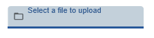
Properties when File is selected as inputType:
|
Name |
Description and Comments |
JavaScript |
Shipped default |
|---|---|---|---|
|
enabled |
Indicates whether this element is enabled. TS2 only. |
Yes. Must return a Boolean. |
True |
|
helpertext |
The helper text provides supplemental information to users. For Material Design theme only. |
Yes. Must return a String. |
None |
|
helpertextStyle |
CSS properties to be applied to helpertext or validation message of this eXtension. For Material Design theme only. |
Yes. Must return a valid style object. |
None |
|
icon |
The name of icon to display. For Material Design theme only. |
Yes. Must return a String. |
folder_open |
|
iconPosition |
Specify whether to display the icon as leading or trailing. The values are Left Position and Right Position. For Material Design theme only. |
No |
Left Position |
|
iconStyle |
CSS properties to be applied to icon. For Material Design theme only. |
Yes. Must return a valid style object. |
None |
|
inputType |
List of input elements that can be selected. Current values are Color, Email, File, Furigana, Number, Password, and URL. Text is the default value when none is selected. |
No. |
File |
|
labelStyle |
CSS properties to be applied to label (placeholderText). For Material Design theme only. |
Yes. Must return a valid style object. |
None |
|
multiple |
When enabled, multiple file selection is possible; otherwise only a single file can be selected. |
Yes. Must return a Boolean.
|
False |
|
onBlur |
Optional. JavaScript code to be executed when the element loses the focus. |
Yes |
None |
|
onChange |
Optional. JavaScript code to be executed when the value changes. |
Yes |
None |
|
onFocus |
Optional. JavaScript code to be executed when the element receives the focus. |
Yes |
None |
|
onScreenReady |
Optional. JavaScript code to be executed every time layout render of all extension is completed. |
Yes |
None |
|
required |
Indicates whether this extension must be filled up. |
Yes. Must return a Boolean. |
False |
|
style |
CSS properties to be applied to the eXtension. |
Yes. Must return a valid style object |
None |
|
textFieldStyle |
Specify the appearance of the multitype input box extension as a TextField object. The values are Standard and Outlined. For Material Design theme only. |
No |
Standard |
|
type |
Indicates the file type filter. Possible values are All, Audio, Image, Video. |
No |
All |
|
validationMessage |
The message to replace the default validation message. |
Yes. Must return a String. |
None |
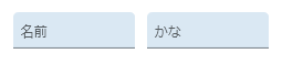
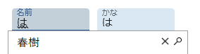
Properties when Furigana is selected as inputType:
|
Name |
Description and Comments |
JavaScript |
Shipped default |
|---|---|---|---|
|
enabled |
Indicates whether this element is enabled. TS2 only. |
Yes. Must return a Boolean. |
True |
|
helpertext |
The helper text provides supplemental information to users. For Material Design theme only. |
Yes. Must return a String. |
None |
|
helpertextStyle |
CSS properties to be applied to helpertext or validation message of this eXtension. For Material Design theme only. |
Yes. Must return a valid style object. |
None |
|
icon |
The name of icon to display. For Material Design theme only. |
Yes. Must return a String. |
None |
|
iconPosition |
Specify whether to display the icon as leading or trailing. The values are Left Position and Right Position. For Material Design theme only. |
No |
Left Position |
|
iconStyle |
CSS properties to be applied to icon. For Material Design theme only. |
Yes. Must return a valid style object. |
None |
|
inputType |
List of input elements that can be selected. Current values are Color, Email, File, Furigana, Number, Password, and URL. Text is the default value when none is selected. |
No |
Furigana |
|
kanaStyle |
CSS properties to be applied to the Kana output portion of the eXtension. |
Yes. Must return a valid style object. |
None |
|
kanaType |
Either Hiragana or Katakana. |
Yes |
Hiragana |
|
labelStyle |
CSS properties to be applied to label (placeholderText). For Material Design theme only. |
Yes. Must return a valid style object. |
None |
|
nameCaption |
A string of characters which stands as the label of the Kana input portion. |
No |
名前 |
|
nameStyle |
CSS properties to be applied to the Kana input portion of the eXtension. |
Yes. Must return a valid style object. |
None |
|
placeholderText |
The text to be displayed as a short hint for this extension. |
Yes. Must return a String. |
Blank |
|
onBlur |
Optional. JavaScript code to be executed when the element loses the focus. |
Yes |
None |
|
onChange |
Optional. JavaScript code to be executed when the value changes. |
Yes |
None |
|
onFocus |
Optional. JavaScript code to be executed when the element receives the focus. |
Yes |
None |
|
onScreenReady |
Optional. JavaScript code to be executed every time layout render of all extension is completed. |
Yes |
None |
|
showCaption |
When enabled, the name and label captions will be shown. Otherwise they are hidden. |
Yes |
True |
|
textFieldStyle |
Specify the appearance of the multitype input box extension as a TextField object. The values are Standard and Outlined. For Material Design theme only. |
No. |
Standard |
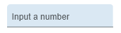
Properties when Number is selected as inputType:
|
Name |
Description and Comments |
JavaScript |
Shipped default |
|---|---|---|---|
|
enabled |
Indicates whether this element is enabled. TS2 only. |
Yes. Must return a Boolean. |
True |
|
helpertext |
The helper text provides supplemental information to users. For Material Design theme only. |
Yes. Must return a String. |
None |
|
helpertextStyle |
CSS properties to be applied to helpertext or validation message of this eXtension. For Material Design theme only. |
Yes. Must return a valid style object. |
None |
|
icon |
The name of icon to display. For Material Design theme only. |
Yes. Must return a String. |
None |
|
iconPosition |
Specify whether to display the icon as leading or trailing. The values are Left Position and Right Position. For Material Design theme only. |
No |
Left Position |
|
iconStyle |
CSS properties to be applied to icon. For Material Design theme only. |
Yes. Must return a valid style object. |
None |
|
inputType |
List of input elements that can be selected. Current values are Color, Email, File, Furigana, Number, Password, and URL. Text is the default value when none is selected. |
No |
Number |
|
labelStyle |
CSS properties to be applied to label (placeholderText). For Material Design theme only. |
Yes. Must return a valid style object. |
None |
|
maxNum |
Maximum value that can be set. |
Yes |
10 |
|
minNum |
Minimum value that can be set. |
Yes |
0 |
|
onBlur |
Optional. JavaScript code to be executed when the element loses the focus. |
Yes |
None |
|
onChange |
Optional. JavaScript code to be executed when the value changes. |
Yes |
None |
|
onFocus |
Optional. JavaScript code to be executed when the element receives the focus. |
Yes |
None |
|
onScreenReady |
Optional. JavaScript code to be executed every time layout render of all extension is completed. |
Yes |
None |
|
placeholderText |
The text to be displayed as a short hint for this extension. |
Yes. Must return a String. |
None |
|
required |
Indicates whether this extension must be filled up. |
Yes. Must return a Boolean. |
False |
|
step |
Unit scale for each increment or decrement. |
Yes |
1 |
|
style |
CSS properties to be applied to the eXtension. |
Yes. Must return a valid style object |
None |
|
textFieldStyle |
Specify the appearance of the multitype input box extension as a TextField object. The values are Standard and Outlined. For Material Design theme only. |
No |
Standard |
|
validationMessage |
The message to replace the default validation message. |
Yes. Must return a String. |
None |
|
value |
Indicates the initial value of the input element. |
Yes |
0 |
Properties when Password is selected as inputType:
|
Name |
Description and Comments |
JavaScript |
Shipped default |
|---|---|---|---|
|
Enabled |
Indicates whether this element is enabled. TS2 only. |
Yes. Must return a Boolean. |
True |
|
helpertext |
The helper text provides supplemental information to users. For Material Design theme only. |
Yes. Must return a String. |
None |
|
helpertextStyle |
CSS properties to be applied to helpertext or validation message of this eXtension. For Material Design theme only. |
Yes. Must return a valid style object. |
None |
|
icon |
The name of icon to display. For Material Design theme only. |
Yes. Must return a String. |
None |
|
iconPosition |
Specify whether to display the icon as leading or trailing. The values are Left Position and Right Position. For Material Design theme only. |
No |
Left Position |
|
iconStyle |
CSS properties to be applied to icon. For Material Design theme only. |
Yes. Must return a valid style object. |
None |
|
inputType |
List of input elements that can be selected. Current values are Color, Email, File, Furigana, Number, Password, and URL. Text is the default value when none is selected. |
No |
Password |
|
labelStyle |
CSS properties to be applied to label (placeholderText). For Material Design theme only. |
Yes. Must return a valid style object. |
None |
|
maxLength |
The maximum number of characters allowed. By default, this is set to the standard Javascript maximum value. |
Yes |
524288 |
|
onBlur |
Optional. JavaScript code to be executed when the element loses the focus. |
Yes |
None |
|
onChange |
Optional. JavaScript code to be executed when the value changes. |
Yes |
None |
|
onFocus |
Optional. JavaScript code to be executed when the element receives the focus. |
Yes |
None |
|
onScreenReady |
Optional. JavaScript code to be executed every time layout render of all extension is completed. |
Yes |
None |
|
pattern |
The regular expression to check against the value of this extension. |
Yes. Must return a String. |
None |
|
placeholderText |
The text to be displayed as a short hint for this extension. |
Yes. Must return a String. |
None |
|
required |
Indicates whether this extension must be filled up. |
Yes. Must return a Boolean. |
False |
|
style |
CSS properties to be applied to the eXtension. |
Yes. Must return a valid style object |
None |
|
textFieldStyle |
Specify the appearance of the multitype input box extension as a TextField object. The values are Standard and Outlined. For Material Design theme only. |
No |
Standard |
|
validationMessage |
The message to replace the default validation message. |
Yes. Must return a String. |
None |
|
value |
Indicates the initial value of the input element. |
Yes. Must return a String. |
None |
Properties when URL is selected as inputType:
|
Name |
Description and Comments |
JavaScript |
Shipped default |
|---|---|---|---|
|
enabled |
Indicates whether this element is enabled. TS2 only. |
Yes. Must return a Boolean. |
True |
|
helpertext |
The helper text provides supplemental information to users. For Material Design theme only. |
Yes. Must return a String. |
None |
|
helpertextStyle |
CSS properties to be applied to helpertext or validation message of this eXtension. For Material Design theme only. |
Yes. Must return a valid style object. |
None |
|
icon |
The name of icon to display. For Material Design theme only. |
Yes. Must return a String. |
None |
|
iconPosition |
Specify whether to display the icon as leading or trailing. The values are Left Position and Right Position. For Material Design theme only. |
No |
Left Position |
|
iconStyle |
CSS properties to be applied to icon. For Material Design theme only. |
Yes. Must return a valid style object. |
None |
|
inputType |
List of input elements that can be selected. Current values are Color, Email, File, Furigana, Number, Password, and URL. Text is the default value when none is selected. |
No |
URL |
|
labelStyle |
CSS properties to be applied to label (placeholderText). For Material Design theme only. |
Yes. Must return a valid style object. |
None |
|
onBlur |
Optional. JavaScript code to be executed when the element loses the focus. |
Yes |
None |
|
onChange |
Optional. JavaScript code to be executed when the value changes. |
Yes |
None |
|
onFocus |
Optional. JavaScript code to be executed when the element receives the focus. |
Yes |
None |
|
onScreenReady |
Optional. JavaScript code to be executed every time layout render of all extension is completed. |
Yes |
None |
|
pattern |
The regular expression to check against the value of this extension. |
Yes. Must return a String. |
None |
|
placeholderText |
The text to be displayed as a short hint for this extension. |
Yes. Must return a String. |
None |
|
required |
Indicates whether this extension must be filled up. |
Yes. Must return a Boolean. |
False |
|
style |
CSS properties to be applied to the eXtension. |
Yes. Must return a valid style object |
None |
|
textFieldStyle |
Specify the appearance of the multitype input box extension as a TextField object. The values are Standard and Outlined. For Material Design theme only. |
No |
Standard |
|
validationMessage |
The message to replace the default validation message. |
Yes. Must return a String. |
None |
|
value |
Indicates the initial value of the input element. |
Yes. Must return a String. |
None |
Notes, Comments and Warnings
This eXtension works only in the advanced terminal emulator (TS2) and is not intended to be run in the basic terminal emulator (TS1).
The eXtension properties will be updated automatically according to the selected input type.
To dynamically read the value of the eXtension in a script, use the code:
FIELDS( <base name> ).getProperty( “value” );
Where <base name> is the value of the “name” property under the “Basic”, sub-pane of the “eXtensions” pane in TS2 Developer.
That is, the code is applicable for all the given input types except for the Furigana type. To get the values for of the two input elements in the Furigana eXtension, use this code:
GETKANAVALUE1( <base name> );
GETKANAVALUE2( <base name> );
Where <base name> is the value of the “name” property under the “Basic”, sub-pane of the “eXtensions” pane in TS2 Developer.
GETKANAVALUE1 is a common user function that retrieves the value of the Kana input element. GETKANAVALUE2 is also a common user function that retrieves the value of the Kana output element.
When the input type is File, the file object list associated with the files selected by this extension can be retrieved using the following code:
GETFILES( <base name> );
Where <base name> is the value of the “name” property under the “Basic”, sub-pane of the “eXtensions” pane in TS2 Developer.
GETFILES is a common user function that retrieves the array of File objects set in this extension.
The value of placeholderText property displayed in this extension has a fixed style color of #999. Even if this extension’s style->color property is set to another color, the display of the placeholder text will not be affected.
Color input type is not supported in IE/Edge.
Each of the input types, depending on the input restrictions set, is automatically validated as the user types the value.
In case of invalid value, an error icon is displayed at the right side of the input box. When the mouse is hovered on the error icon, the browser’s built-in message is displayed as follows:
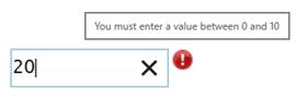
IE 11 is used in the above image.
Please note that the error message is browser-dependent.
But this message can be customized by setting a value to validationMessage property.
In addition, when this extension is added to an aXes input field that needs to be posted and it contains input validation error, a message will display on the status bar as follows and the screen will not be posted:

When prompter property is checked, an ellipsis will be attached to the field as follows:
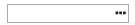
When the user clicked on the ellipsis, the Javascript code defined in onPrompterClick property will be executed. The default is to send the F4 key for prompt.
In Application, appStylesTheme property = JQueryUI
When jQueryUI is selected from appStylesTheme property of the Application, the display will change according to the theme that was set in the Application’s jqueryTheme property. Basically, the default border and the font styles will be based on the JQuery theme.
In Application, appStylesTheme property = Material Design
When Material Design is selected from appStylesTheme property of the Application, the display will change according to the theme that was set in the Application’s mdTheme property.
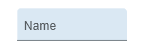
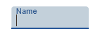
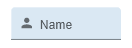
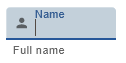
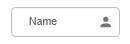
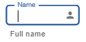
In Material Design theme, the Multitype Input Box extension is displayed as a Text Field component. The value in placeholderText property acts as the label of the eXtension.
Below are examples how this eXtension is displayed:
| Properties to set | Initial Display | When this eXtension is focused or a character is typed | |
|---|---|---|---|
| 1 |
inputType: <default> |
 |
 |
| 2 |
inputType: <default> |
 |
 |
| 3 |
inputType: <default> |
 |
|
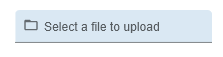
| 4 |
inputType: File |
 |
 |
| 5 |
inputType: Furigana |
 |
 |
| 6 |
inputType: Number |
 |
When input is invalid: 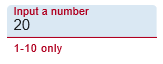 |
See Also
Application Style Collection for Application themes