axKeypad
Description
This is a text element which attaches a default jQuery keypad with a decimal character.
Usability
|
Context |
Supported |
|---|---|
|
Input screen fields |
Yes |
|
Output screen fields |
No |
|
Input subfile fields |
No |
|
Output subfile fields |
No |
|
New screen elements |
Yes |
Properties
|
Name |
Description and Comments |
JavaScript |
Shipped default |
|---|---|---|---|
|
value |
Initial element value to be displayed. |
Yes. Must return a string. |
None |
|
style |
Additional style properties that should be applied to the element. |
Yes. Must return a valid style object. |
None |
|
maxInputLength |
If specified, this will set the maximum number of characters that can be entered. |
Yes. Must return a number. |
0 |
|
onFocus |
Optional. JavaScript code to be executed when the element receives the focus. |
Yes. |
None |
|
onBlur |
Optional. JavaScript code to be executed when the element lost the focus. |
Yes. |
None |
|
enabled |
Indicates whether this element is enabled. TS2 only. |
Yes. Must return a Boolean. |
True |
|
layout |
The keypad layout to be applied. Comma separated strings can be inputted or an array of string in the script editor. TS2 only. |
Yes. Must return an array of strings. |
None |
|
prompt |
The text that will displayed on top of the keypad. TS2 only. |
Yes. Must return a string. |
None |
|
allowKeyboardInput |
Indicate whether entry by keyboard is enabled. TS2 only. |
Yes. Must return a Boolean. |
False |
|
randomise |
Indicate whether to randomise the keys' positions on every show of the keypad. TS2 only. |
Yes. Must return a Boolean. |
False |
|
label |
The text that will be displayed as label above the input element. For Material Design theme only. |
Yes. Must return a String. |
Blank |
|
labelStyle |
CSS properties to be applied to label. For Material Design theme only. |
Yes. Must return a valid style object. |
Blank |
|
textFieldStyle |
Specify the appearance of the Keypad extension as a Text Field component. The values are Standard and Outlined. For Material Design theme only. |
No |
Standard |
Notes, Comments and Warnings
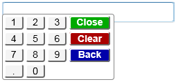
When language is set to non-French, the following keypad eXtension with decimal point character will be displayed:
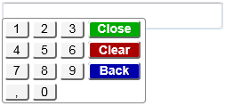
And if set to French, the following keypad eXtension with the comma character as the decimal point will be displayed:
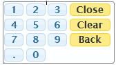
In application, appStylesTheme property = JQueryUI
When JQueryUI is selected in Application->Styling->appStylesTheme property, the display will change according to the theme that was set in the Application’s jqueryTheme property. Unlike the Basic extension which only uses the smoothness theme, when JQUeryUI is selected in appStylesTheme property, the theme of this extension will also change by applying the JQuery theme that is set in the jqueryTheme property.
The display when redmond theme is set:
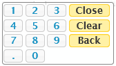
The display when ui-lightness theme is set:
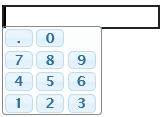
layout Property
The layout of the keypad can be changed using this property. Setting the “.0,789,456,123” string into the layout property
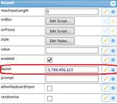
will result in the extension being display this way:
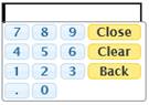
Set the following script
"['789' + $.keypad.CLOSE, '456' + $.keypad.CLEAR, '123' + $.keypad.BACK, '.0']"
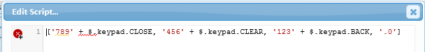
will result in the keypad being display this way:
Setting the value “$.keypad.qwertyLayout” in the script mode will result in the following display:
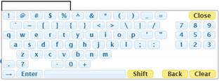
$.keypad.qwertyLayout is a jQuery constant that indicates to the keypad to use the standard QWERTY layout when displaying the keypad. Other constants that can be use are the following:
$.keypad.numericLayout: Standard numeric layout
$.keypad.qwertyAlphabetic: Standard US keyboard alphabetic layout
$.keypad.qwertyLayout: Standard US keyboard layout
For special key markers, the following can be used:
$.keypad.CLOSEt: Close button
$.keypad.CLEAR: Clear button
$.keypad.BACK: Back button
$.keypad.SHIFT: Shift button
$.keypad.SPACE_BAR: Space bar button
$.keypad.ENTER: Enter button
$.keypad.SPACE: Empty space
$.keypad.HALF_SPACE: Empty half space
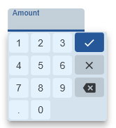
In application, appStylesTheme property = Material Design
When Material Design is selected in Application->Styling->appStylesTheme property, the display will change according to the theme that was set in the Application’s mdTheme property.
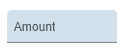
In Material Design theme, the keypad extension is displayed as a Text Field component.
When the label property is set, the extension will be displayed as follows:
And when the extension is clicked:
See Also
Application Style Collection for Application themes