axFab
Description
allows a floating action button to be inserted into the 5250 screen. Floating action buttons represents the primary action in an application. Only one floating action button is recommended per screen to represent the most common action.
Usability
|
Context |
Supported |
|---|---|
|
Input screen fields |
No |
|
Output screen fields |
Yes |
|
Input subfile fields |
No |
|
Output subfile fields |
No |
|
New screen elements |
Yes |
Properties
|
Name |
Description and Comments |
JavaScript |
Shipped default |
|---|---|---|---|
|
buttonType |
The type of material fab button style applied to the button. The values are standard, mini and extended. | No | standard |
|
caption |
Specifies the text that is to appear on the button. | Yes. Must return a string. | None |
|
enabled |
Indicates whether this element is enabled. TS2 only. |
Yes. Must return a Boolean. | True |
|
icon |
Specifies a name of icon to display | Yes. Must return a string. | None |
|
onClick |
Optional. JavaScript code to be executed when the user clicks on the button. | Yes | SENDKEY(ENV.defaultKey); |
|
onFocus |
Optional. JavaScript code to be executed when the element receives the focus. | Yes | None |
|
onBlur |
Optional. JavaScript code to be executed when the element lost the blur. | Yes | None |
|
sizeToField |
Indicates whether this button should be sized to fill its containing field or automatically sized to match its content. | Yes | True |
|
tooltip |
The tool tip (or hint) that should appear when the user hovers the mouse over this button. | Yes. Must return a string. | None |
Notes, Comments and Warnings
This extension is available only in material design theme. The caption property only works on extended fab button type.
Examples
(1). An example of a standard fab button type and home icon.
changed the icon property to home

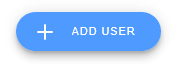
(2). An example of an extended fab button type and add icon with add caption.
changed the following property:
- caption property: Add User
- buttonType property: extended
- icon property: add
Icon property
The icons that you can use is based on the localized version (shipped with axes) of google material design icon (web fonts). See https://material.io/tools/icons/?style=baseline for the list of icons.
See Also
Application Style Collection for Application themes