axDate
Description
axDate allows a date field to be displayed and edited in various ways.
This component can be dropped on a date field (input or output). The component will then display its own version of the field.
For input fields, a calendar button can also be displayed.
When the user clicks the calendar button, a calendar will display. The calendar will show the date from the field as the selected date, or if the date in the field is null or unrecognizable, the current date. If the user clicks on a day in the calendar, the date in the field will be changed accordingly. If the user does not click on a day, no change to the date will be made.
When the user clicks on the edit field (for input date fields only) the date displayed will be changed to the edit format and selected. When the user moves away, the date format will revert to the normal display format.
Note: All properties can have a soft coded system default value. If a property is unspecified for an instance of this control, then the system default is checked, and if that is not found, the controls default value is used. This allows systems where the same date formats are used throughout to use DatePickers with no properties specified.
Usability
|
Context |
Supported |
|---|---|
|
Input screen fields |
Yes |
|
Output screen fields |
Yes |
|
Input subfile fields |
Yes |
|
Output subfile fields |
Yes |
|
New screen elements |
Yes |
Properties
|
Name |
Description and Comments |
JavaScript |
Shipped default |
|---|---|---|---|
|
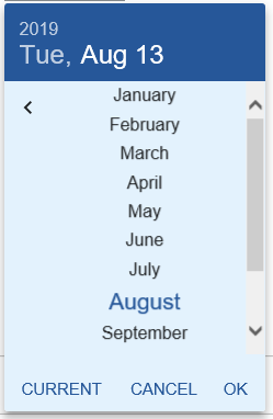
calendarMonthSelect |
Allow the user to select a month from a drop down, on the calendar |
Yes |
False |
|
calendarThinImage |
Deprecated. See hideCalendarImage. Use a thin image for the calendar icon |
Yes |
False |
|
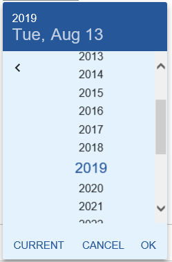
calendarYearSelect |
Allow the user to select a year from a drop down, on the calendar |
Yes |
False |
|
dateFormatDisplay |
This is the format the date will be shown in, unless the user has clicked on the date to edit it |
Yes |
Language default |
|
dateFormatEdit |
This is the format the date will be shown in when the user clicks on the field to edit it |
Yes |
Language default |
|
dateFormatServer |
This is the format the date would be shown in if there was no date extension applied |
Yes |
Language default |
|
enabled |
Indicates whether this element is enabled. TS2 only. |
Yes. Must return a Boolean. |
True
|
|
helpertext |
The helpertext provides supplemental information to users. For Material Design theme only. |
Yes. Must return a valid string. |
None |
|
helpertextStyle |
CSS properties to be applied to helpertext. For Material Design theme only. |
Yes. Must return a valid style object. |
None |
|
hideCalendarImage |
Specifies whether to show or hide the calendar image. |
Yes |
False |
|
iconPosition |
Specify whether to display the calendar icon as leading or trailing. The values are Left Position and Right Position. For Material Design theme only. |
No |
Left Position |
|
iconStyle |
CSS properties to be applied to calendar icon. For Material Design theme only. |
Yes. Must return a valid style object. |
None |
|
ignoreInvalidCharacters |
If true this disables the aXes character checking that would occur when running in TS2 mode. This is useful when using this extension with numeric fields that use edit words to provide non-numeric date characters. |
Yes |
False |
|
label |
The text that will be displayed as the label of this eXtension. For Material Design theme only. |
Yes. Must return a valid String. |
None |
|
labelStyle |
CSS properties to be applied to the label of this eXtension. For Material Design theme only. |
Yes. Must return a valid style object. |
None |
|
maximumDate |
The maximum date that can be set. |
Yes |
None |
|
minimumDate |
The minimum date that can be set. |
Yes |
None |
|
onBlur |
Optional. JavaScript code to be executed when the element lost the focus. |
Yes |
None |
|
onFocus |
Optional. Javascript code to be executed when the field receives the focus. |
Yes |
None |
|
onSelectedValueChanged |
Optional. JavaScript code to be executed when the field value has changed. |
Yes |
None |
|
orientation |
Specify the display orientation of the calendar. For Material Design theme only. |
No |
Portrait |
|
showConfirmButton |
Deprecated. See showButtonPanel. Enables buttons for confirm and cancel on the calendar |
Yes |
False
|
|
showButtonPanel |
Specifies whether to display a button pane underneath the calendar that contains Today and Close buttons. |
Yes |
False |
|
style |
CSS to apply to the element. |
Yes. Must return a valid style object. |
None |
|
textFieldStyle |
Specify the appearance of Date input field as a TextField object. The values are Standard and Outlined. For Material Design theme only. |
No |
Standard |
|
yearSelectValue |
A positive value to be added and subtracted to the current year; the corresponding range of values will be listed in the year dropdown element. |
Yes |
None |
Property Values for date formats
|
Caption |
Description and Comments |
Value |
|
language default |
This means use the format for the language the user is working in. (This format is specified in Text_Cust_xx.txt, where xx is the language code for the user) |
default |
|
day dd month yyyy |
Show a value like "Sunday 26 April 2009" |
DD d MM yy |
|
|
|
|
|
d/mm/yy |
Show a value like 7/03/09 |
d/mm/y |
|
dd/mm/yy |
Show a value like 07/03/09 |
dd/mm/y |
|
d/mm/yyyy |
Show a value like 7/03/2009 |
d/mm/yy |
|
dd/mm/yyyy |
Show a value like 170309 or 07/03/2009 |
dd/mm/yy |
|
ddmmyy |
Show a value like 170309 or 070309 |
ddmmy |
|
ddmmyyyy |
Show a value like 17032009 or 07032009 |
ddmmyy |
|
similarly for other formats: |
|
|
|
mm/dd/yy |
|
mm/dd/y |
|
mm/dd/yyyy |
|
mm/dd/yy |
|
mmddyy |
|
mmddy |
|
yy/mm/dd |
|
y/mm/dd |
|
yyyy/mm/dd |
|
yy/mm/dd |
|
yymmdd |
|
ymmdd |
|
yyyymmdd |
|
yymmdd |
|
yyyy-mm-dd |
|
yy-mm-dd |
|
yy-mm-dd |
|
y-mm-dd |
Notes, Comments and Warnings
The value for date formats is specified according to the format rules for the jQuery Datepicker. The caption is a more intuitive version.
The properties of the Date Picker can be stored at different levels:
You can specify a default date format for all date pickers in the application, by using edit application properties, and then editing the properties of the date extension.
You can override the default date formats for an individual date picker on a screen, by editing its properties.
If you are building an application where different users will use different date formats depending on their language, then you need to specify the default date formats you want for each language (for dateFormatDisplay, dateFormatEdit, and dateFormatServer), in the Text_Cust_xx.txt file. Then, if the date format properties of the datepicker are "language default", it will use the language dependent format.
(The language for each user will be determined from their iSeries user profile)
The ignoreInvalidCharacters option is usually not necessary. It is only needed when working with a numeric field where the iSeries edit word for the field causes non-numeric characters (e.g. typically the / characters) to appear in some circumstances and not in others. This could happen if when the date is zero, the slashes are not shown, and when the date is non-zero the slashes are shown. For fields where the non-numeric characters always appear, then there is no need to use the ignoreInvalidCharacters option.
ignoreInvalidCharacters is applicable in TS2 mode only.
On mobile devices (Android, iPad, etc..), when the date input field receives the focus, the virtual keypad will appear prompting the user to enter the date string.
When the calendar button receives the focus, a calendar dialog only will appear, and the virtual keypad is hidden.
Examples
If the date was normally presented like this (without an extension)

And a Date visualization was added to the field, and the properties were set as follows:
dateFormatDisplay: day dd month yyyy
dateFormatEdit: ddmmyy
dateFormatServer : dd/mm/yy
(where the dateFormatServer has been chosen to match the way the date would be shown without an extension)
When the date field appears in output mode, it will look like this:

When the date field appears in input mode, it will look like this:

If the user clicks on the field in input mode, it will look like this:

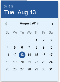
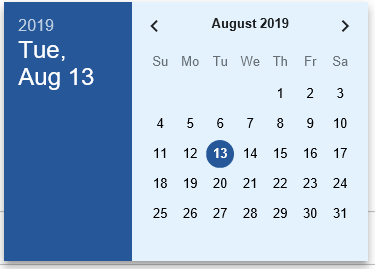
If the user clicks on the calendar button, a calendar will appear, like this:

If hideCalendarImage property is set to true, the calendar image will be hidden and the user can click on the field to show the calendar.
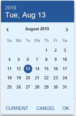
If showButtonPanel property is set to true, the buttons for today (current date) and close are displayed like this:

The presence of the month and year selection dropdowns are controlled by the properties:
calendarMonthSelect
calendarYear Select
So the calendar can be made to appear like this:

To enable the setting of calendar year range, first set calendatYear to true, remove the minimumDate and maximumDate values, then set the yearSelectValue. Below is the example when yearSelectValue is set to 5.

In mobile devices where touch screens are prevalent and virtual keypad is the means for user input, clicking the calendar button will only show the date picker and not the virtual keypad. The virtual keypad will only show when the date field is clicked.
In Application, appStylesTheme property = JQueryUI
When JQueryUI is selected from appStylesTheme property of the Application, the display will change according to the theme that was set in the Application’s jqueryTheme property. Unlike the Basic extension which only uses the smoothness theme, when the JQueryUI is selected, the theme of this extension will also change by applying the JQuery theme that is set in the jqueryTheme property.
The display when redmond theme is set:

The display when ui-lightness theme is set:

In Application, appStylesTheme property = Material Design
When Material Design is selected from appStylesTheme property of the Application, the display will change according to the theme that was set in the Application’s mdTheme property.
In Material Design theme, the Date extension is displayed as a Text Field component as follows:

When helpertext is set, it always display below the field as it cannot be seen anymore when calendar is displayed.

Below are the sample display of calendar when corresponding properties are set:
|
|
Properties to set |
Calendar Display |
|
1 |
orientation: Portrait |
 |
|
2 |
orientation: Portrait |
 |
|
3 |
When year is clicked |
 |
|
4 |
When month is clicked |
 |
|
5 |
orientation: Landscape |
 |
See Also
Dates in Tutorial 6 - Advanced Screen Enhancement
Example – Using a date format not available in the Date eXtension
Application Style Collection for Application themes